Minimalism vs Maximalism: Designs to spark joy on your website
- Last Updated : November 14, 2024
- 1.2K Views
- 7 Min Read
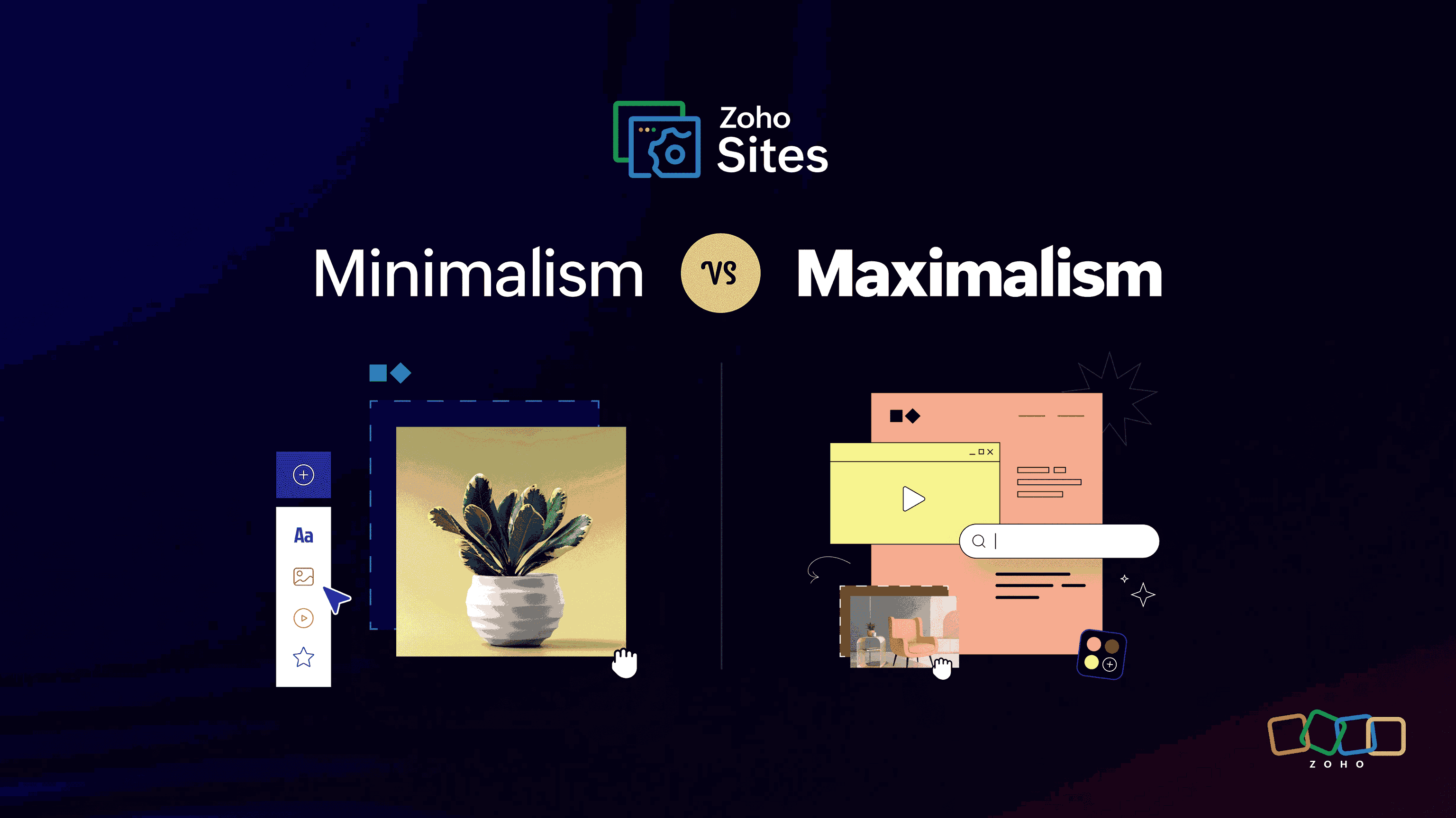
Do you know how some people often stand in front of a wardrobe full of clothes and say that they have nothing to wear? In the ever-evolving world of website design, choosing between minimalism and maximalism can feel like this: do you opt for the sleek, timeless appeal of a little black dress or the dazzling statement of a sequined jumpsuit? Both styles have their ardent fans and distinct philosophies, promising to spark joy in their own unique way.
Imagine your website as a living room. Minimalism invites guests into an uncluttered space where every element has its purpose—a sanctuary of calm where users can relax and navigate effortlessly. On the other hand, maximalism throws open its doors with exuberance, offering a feast for the eyes that's akin to stepping into Willy Wonka’s chocolate factory; it's bold, eclectic, and unmistakably memorable.
Picking a design style is vital for how users interact with your site. So whether you're team minimal or team maximal (or somewhere in between), buckle up as we dive deep into which aesthetic will make your visitors stay. Feeling intrigued already? You should be!
The power of negative space in web design
Picture this: Consider walking through a garden overtaken by weeds and tangled vines that obscure any path or bloom. Stifling, don't you agree? Now imagine strolling through a well-tended landscape where each plant has its designated spot, creating an oasis of calm and clarity for your senses.
That’s the magic of negative space (or white space) in web design. It’s not just about "less is more"; it's about strategically using empty areas to let your content shine and ensure users aren't overwhelmed by too much info.
To nail that clean look on your site without making your website feel like an abandoned ghost town, breathe life into your layout by playing around with line height, padding, and margins—it’ll naturally direct user focus where you want it. Don't go overboard with CTAs; instead, scatter them sparingly to declutter the user's visual journey. Ditto for images and graphics—quality trumps quantity here.
Minimalist typography trends for a sleek website look
Imagine you're scrolling through a sleek, minimalist website and the fonts are so on point you almost want to ask them out for coffee. Fonts like Helvetica neue, Futura, and Avenir are your go-to's for that clean, no-nonsense look. They're the James Dean of fonts—simple yet oozing coolness. These typefaces scream (actually, whisper) sophistication without needing flashy embellishments.
Principles of minimalism:
- Clarity and simplicity
- Use of white space
- Limited color palette
- Typography hierarchy
- Intuitive navigation
- Functional design elements
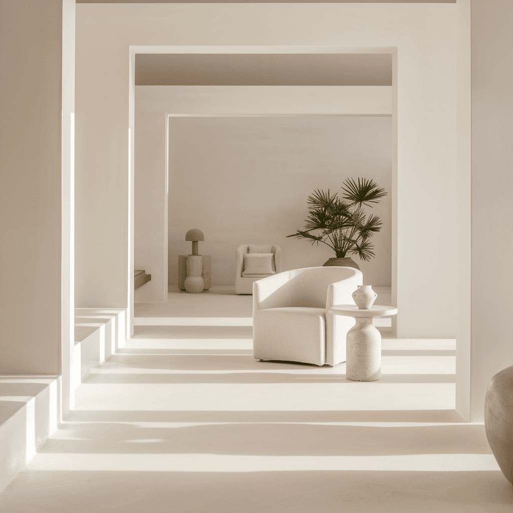
Good typography enhances readability and user experience by creating visual hierarchy. It’s like giving your content neon signs saying, "Hey! Look here!" while still keeping everything chill and readable. Even search engines agree: cleaner fonts ensure better SEO since users find what they need without the extra effort—which means longer visits and happier algorithms. For example, true to Scandinavian design principles, the Nordic Design website features minimalism with a focus on clean lines, neutral colors, and plenty of space, allowing the content to stand out.
Maximalist color palettes to make your website pop
If you're wondering how to play Picasso on your website, start by choosing vibrant color schemes that not only work in harmony but also shout your brand’s personality from the virtual rooftops. Take a cue from brands like Glossier or Urban Outfitters, where bold berry tones meet electric oranges—each hue carefully orchestrated to make your eyes dance.
Principles of maximalism:
- Bold and vibrant color schemes
- Complex layouts with layering
- Eclectic typography
- Rich imagery and graphics
- Decorative details and ornamentation
- Expressive storytelling elements
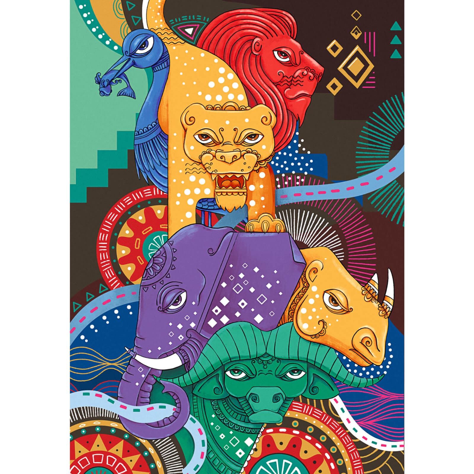
Think Spotify's psychedelic gradients or Mailchimp's sunny yellows and cheery blues—these aren't just random splashes of paint but deliberate choices that attract attention while weaving brand identity seamlessly into visual storytelling.
But, wait! Before you turn your website into an explosion at the Crayola factory, there are creative (and strategic) ways to incorporate these energetic palettes without inducing migraines.
Balance is key; use saturated colors for main elements like headers and CTA buttons while reserving calmer shades for background areas. Remember Adobe’s Creative Cloud website? It mixes muted grays with jewel tones smartly to keep things captivating yet navigable. Try layering textures and patterns—think polka dots meeting plaid—to add depth without overwhelming sanity.
So go ahead, embrace those daring colors and let them show off what makes your brand one-of-a-kind! After all, why blend in when you were born to stand out?
Decluttering your website: Minimalism for improved user experience
Alright, folks, it's time to talk about decluttering your website. Think of it as the Marie Kondo approach to web design: does that element spark joy—or just a headache?
Now, how do you tackle this digital decluttering project without losing your mind?
Audit every page of your site. Identify elements that are redundant or simply aren't pulling their weight—bye-bye useless widgets and filler content.
Prioritize readability. Simplify navigation bars; keep only the essentials and make sure menus are straightforward.
Use tools like heat maps to see where users click most often and streamline accordingly.
Cut down on visuals that don't add value—a single impactful image can be more compelling than a cluttered gallery of almost-good-enough pics.
Need some inspo? Take a look at Airbnb’s before-and-after transformation. Their old site was jam-packed with text blocks and unnecessary buttons plastered everywhere like confetti after New Year's Eve. Post-declutter? Clean lines, clear CTAs, and oodles of white space let those stunning property photos shine without competing for eyeballs.
The art of layering: Using maximalist design elements to create visual interest
Have you ever opened a website and immediately felt like you walked into an art gallery? That’s the magic of maximalism. It's about layering textures, patterns, and visuals until your site looks like a masterpiece.
First off—textures, folks! Think beyond flat designs. Imagine incorporating subtle gradients, shadow effects, or even 3D elements. It’s like taking your favorite plain bagel and adding cream cheese, lox, capers—the whole shebang. Take a look at Gucci's website for instance; you'll find intricate textures complementing bold colors in a dance that demands attention yet keeps everything cohesive.
Use design patterns to create visual hierarchy
Now onto patterns: Z-patterns, F-patterns—these are classic layout strategies to guide users' eyes naturally across the page.
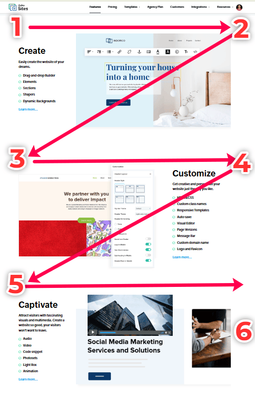
The Z pattern describes a visual scanning path where the reader's eyes move across the top of a page, then diagonally down to the bottom before moving horizontally again, resembling the shape of the letter Z. This pattern works exceptionally well on single-page designs or websites with minimal text because it allows essential information to be strategically placed at key intersection points along this path.
Source: Zoho Sites
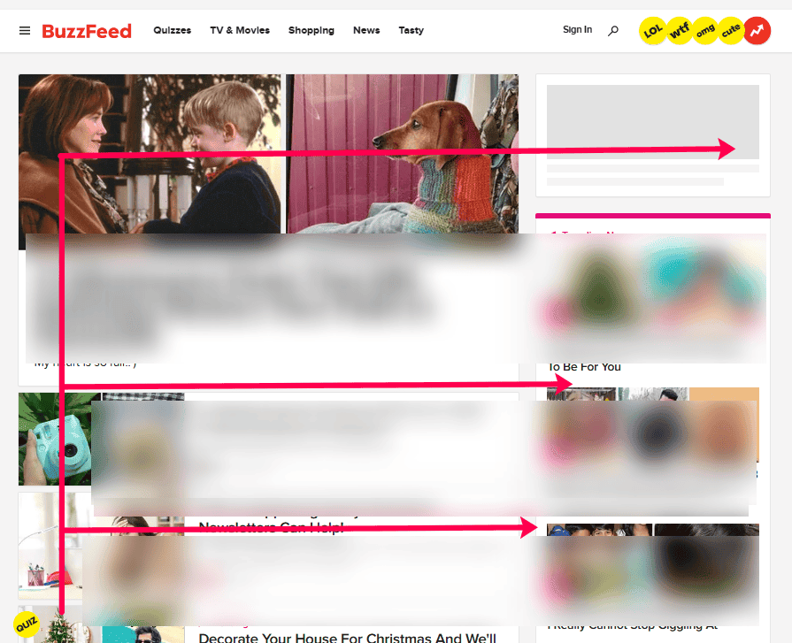
On the other hand, the F pattern is predominantly observed in pages with more text-heavy content. Readers scan a page horizontally at first but then proceed vertically downwards, stopping momentarily if something catches their eye—much like drawing an F. This mimics typical reading behavior where important elements like headings and subheadings become focal points. Designing with this in mind means prioritizing your most critical information along these horizontal lines while ensuring supplementary details fit comfortably below.
Source: Buzzfeed
Throw in some dynamic visuals like animated GIFs or parallax scrolling for added flair without crossing into chaos territory.
But wait—more examples! Disney Plus Hotstar gives us excellent maximalist goals by using high-quality character visuals combined with textured backdrops that evoke nostalgia and excitement in one sweep. Remember to channel your inner Marie Kondo though; each element must spark joy without turning your site into an overwhelming treasure hunt. The trick is to aim for harmony in complexity—a bit like nailing the perfect messy bun look!
Finding balance: How to incorporate both minimalist and maximalist elements into your website
So, you want the best of both worlds? Striking the right balance between minimalist and maximalist elements might sound like a design oxymoron, but with the right techniques, your website can enjoy an aesthetic harmony that's as satisfying as a well-made playlist.
First off, prioritize your site’s functionality and content. Use minimalist principles—think clean lines and lots of breathing room—to keep the navigation straightforward and user-friendly. Now inject some maximalist flair with vibrant images or bold fonts to make key sections pop.
Take Apple's product pages for example (seriously, when do they ever get it wrong?). Apple's overall website screams minimalism—white space galore, simple typography—but then comes a splashy image or video that’s just begging for attention.
Their product pages guide your eyes smoothly through beautifully crafted visuals and crisp text without any unnecessary distractions. This balanced spacing makes their products look even more luxurious and pristine, while still keeping you hooked.
Another strong contender in hybrid design is the Dropbox homepage, which masterfully plays it subtle with intuitive navigation while delighting users with playful illustrations and animations.
To keep visual harmony on fleek (yes, we said 'fleek'), try these practical tips: limit your color palette to a few shades but throw in an unexpected accent color—like that one friend who surprises everyone by going skydiving out of nowhere. Also, experiment with asymmetry; offset a large chunk of negative space with complex visuals elsewhere on the page.
Finally, remember context is everything. What works beautifully for an art portfolio may crash and burn for an ecommerce site smorgasbord—for instance, don't let elaborate animations hijack functional areas where speed and clarity are essential.
Conclusion: Making the right choice for your website’s personality
So, there you have it—two epic design realms to choose from. Minimalism is your go-to if you’re all about sleek lines, simplicity, and giving your users some serious zen vibes. On the flip side, if you're feeling bold and want to shout your brand persona from the rooftops (metaphorically speaking), maximalism has got you covered with its vibrant hues and eye-popping visuals.
At the end of the day, choosing between minimalism and maximalism boils down to what fits your brand's soul. Are you a smooth operator or a neon dreamer? Remember, it’s not just about looking good—it’s about resonating with your audience and making them feel something memorable. Whether it's a peaceful sigh or an energetic "wow," pick what tells *your* story best.
And who says you can't mix both? Be daring, experiment, but most importantly—make sure your site feels like YOU! So, which design tribe are you joining? Team #MinimalSquad or #MaximalCrew? Drop us a comment below!
