- HOME
- BI & Analytics
- Best Dashboard Software: Top 5 Tools Compared
Best Dashboard Software: Top 5 Tools Compared
- Last Updated : May 18, 2026
- 3.8K Views
- 14 Min Read
You've been meaning to track sales or marketing performance, marketing ROI, and operational metrics from a single place. But your team is still pulling numbers from three different tools, exporting to spreadsheets, and emailing updates every week. Or maybe you already have a dashboard tool, but it takes a data analyst to update anything, so business users have stopped trying.
The rise of self-service BI tools has made dashboards accessible to non-technical users.
This guide is for anyone looking for clear answers: what is the best dashboard software, which of these five tools is the right fit for your team, how much they actually cost in practice, and where each tool may fall short.

What is dashboard software?
Dashboard software connects to your data sources, like CRMs, marketing platforms, databases, and finance tools, pulls that data into charts and KPIs, and keeps everything updated in real time. The basic promise is that your team can monitor what's happening without someone manually updating or refreshing a spreadsheet every morning.
The better BI dashboard tools go further. They catch changes in your data before you notice them, let any team member build their own views without filing a request, and answer questions you didn't know you had.
Which dashboard software tools are worth considering ?
- Zoho Analytics — Best for self-serve analytics without the technical overhead
- Tableau — Best for visual storytelling with a dedicated BI team
- Power BI — Best for Microsoft 365 organizations looking for an affordable entry
- Domo — Best for fast, mobile-ready dashboards and real-time alerts
- Looker — Best for data-mature teams with strong engineering support
1. Zoho Analytics
Zoho Analytics: If your team includes both a data analyst who wants SQL access and a marketing manager who needs to build a campaign report herself on a Thursday afternoon, Zoho Analytics is the tool that accommodates both without asking either of them to compromise.
Most tools pick a lane. Zoho Analytics doesn't, which is why it ends up on a lot of shortlists across team types and company sizes.
What it does well
- Drag-and-drop builder for business users: Charts, KPIs, pivot tables, and custom widgets can be created by anyone on the team without touching code. It's full-featured and accessible at the same time.
- 500+ data source integrations: Salesforce, HubSpot, Google Ads, Stripe, MySQL, BigQuery, Snowflake, flat files, along with Zoho apps, configurable sync intervals at every tier.
- Ask Zia, an AI agent that answers questions your team hasn't asked yet: Type a question in plain English, get a chart back in seconds. Ask Zia can build full dashboards from a single query, adjust layouts, change themes, and share with stakeholders, including predictive analytics and trend forecasting. For one-off analytical questions that don't justify building a full report, this is the fastest path to an answer.
- Fine-grained access control: Role-based permissions, row-level security, and collaborative analytics with the ability for team members to comment and annotate directly on dashboards, without giving everyone edit access.
- Dedicated mobile app: Access all your dashboards on the go using your smartphone or tablet with the Zoho Analytics - Dashboards app.
- Embedded dashboards and white labeling: For agencies or teams that need dashboards inside client portals or internal intranets, they can leverage embedded analytics and white labeling.
- Pricing that doesn't surprise you: Plans start at $8/user/month. Per-user, clearly tiered, no credit-based consumption model.
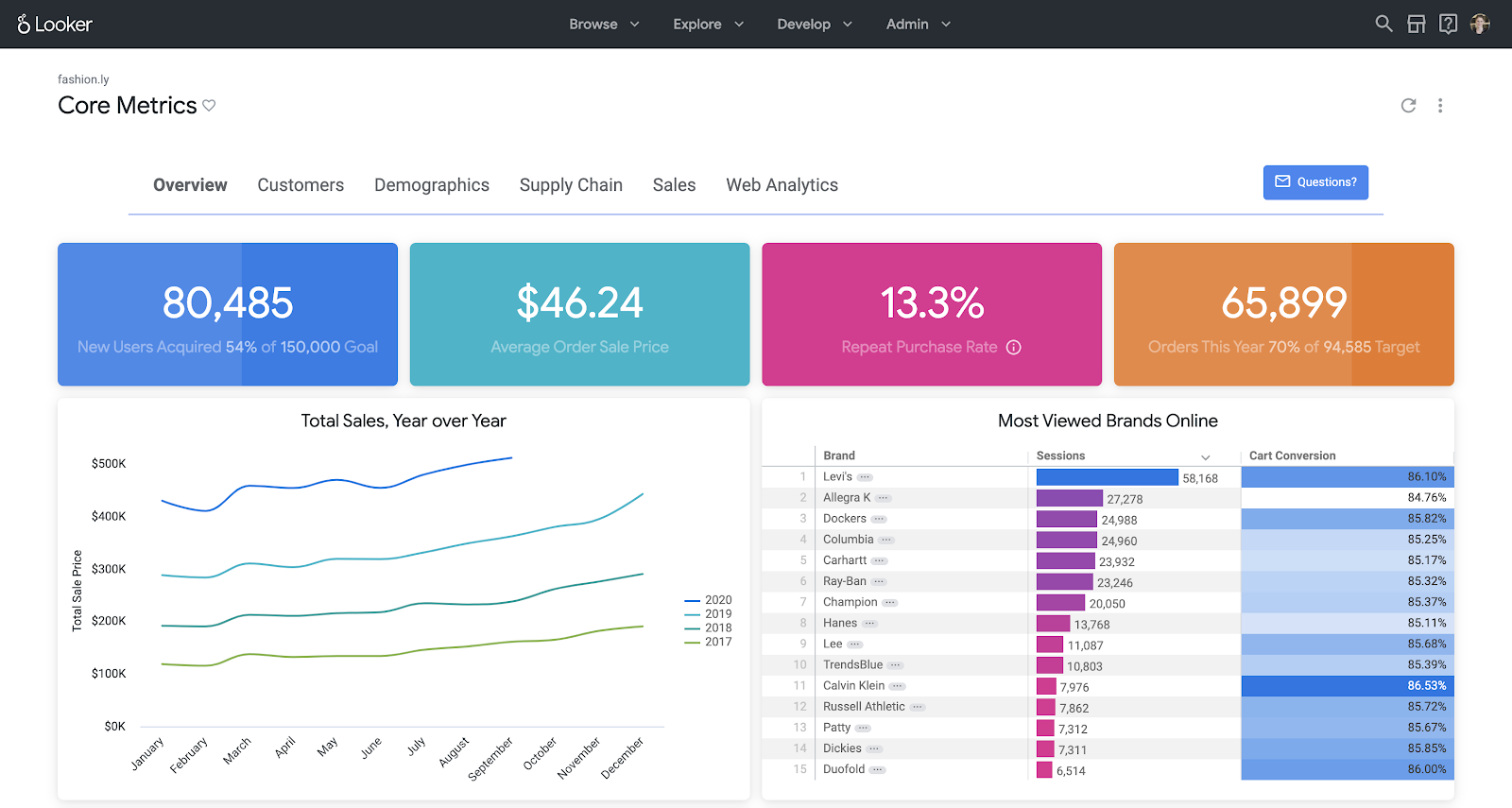
Dashboard example from Zoho Analytics

Where teams usually run into friction
The platform is deep. Custom formulas, multi-dataset blending, and prebuilt ML models work well but take some time to learn properly. Teams that want to use the full feature set should plan a proper onboarding period.
Setup time: Most teams have a working dashboard connected to live data within 1 to 2 hours. A fully configured setup with roles, multiple sources, and sharing in place typically takes a day.
Pricing: Cloud plans start at $8/user/month. A free plan is also available with no time limit.
Customer opinion on Zoho Analytics
"With Zoho Analytics, the time spent creating charts, reports, and dashboards went down by 50%. Our software expenses were reduced by 30%." Read the full case study
— Moises Ochoa, Application Engineer, Cementos Progreso.
Best for
Teams of any size that need fast setup, broad integrations, AI-assisted analysis, and self-service that non-technical users can actually use without training.
Not ideal for
Users who prefer building dashboards entirely with custom code or SQL-first workflows.
Want to see how Zoho Analytics handles your actual data?
2. Tableau
Tableau is often chosen when advanced data visualization is the main priority. It allows users to create complex visualizations such as cohort analysis charts, animated scatter plots, detailed heat maps, and dashboards powered by advanced calculations or integrations with tools like R or Python.
The catch is that "what Tableau can build" and "what your team will build" are often very different things.

Source: Tableau
What it does well
- More chart types and visual customization options than any other tool here. If you've seen a visualization you wanted to replicate, Tableau can probably produce it.
- Calculated fields with R and Python integrations give technical users analytical depth that's hard to match elsewhere.
- Flexible deployment via Tableau Public, Tableau Server, and Tableau Cloud covers most organizational security and infrastructure requirements.
Where teams struggle
Non-technical users hit a wall quickly. The drag-and-drop interface looks approachable, but the moment you need to customize a calculation, fix a data relationship, or troubleshoot why a chart is showing the wrong number, you need someone with actual Tableau training. Most business users end up submitting requests to the analytics team rather than building anything themselves.
At $75/user/month for Creator licenses billed annually, a 10-person analytics team is $9,000 a year before implementation, training, or infrastructure. Reasonable for an enterprise. Hard to justify for a team that needs dashboards, not a full BI practice.
Setup time: 1 to 3 weeks with a dedicated analyst for a well-configured environment. Longer for complex multi-source setups.
Pricing: Creator $75/user/month, Explorer $42/user/month, Viewer $15/user/month, billed annually. For a detailed cost breakdown, see Tableau pricing and its hidden limitations.
User opinion on Tableau
Tableau is based on scientific research, which helps make data analysis faster, more accessible, and more intuitive. The ability to analyze data quickly and iteratively, with immediate feedback, makes using the product engaging, enjoyable, and easy to learn. I think the user experience could be improved to make creating simple, attractive dashboards easier.
- Anirban G., Sr. GTM Analyst
Source: G2.com
Best for
Enterprise organizations with a dedicated BI team, complex visualization requirements, and budget that reflects both.
Not ideal for
Teams without a trained Tableau analyst, anyone expecting business users to build and update their own dashboards, or SMBs doing honest cost-per-value math.
3. Power BI
Power BI's core advantage is that if your organization runs on Microsoft 365, you probably already have access to it, and it already connects to everything your team uses. For organizations that have lived in Excel for years, Power BI is the path of least resistance into proper dashboards.
The limitations are just as specific. Step outside the Microsoft ecosystem and the friction builds fast.

Source: Power BI
What it does well
- Native connections to Excel, Teams, Azure, OneDrive, and SharePoint. Dashboards fit into what people are already using rather than asking them to adopt something separate.
- At $14/user/month for Pro, it's one of the most accessible entry points for enterprise BI.
- The custom visuals marketplace has hundreds of community-built types, and teams with developers can build their own.
- Complex calculated measures, time intelligence functions, and cross-table relationships are all achievable.
Where teams struggle
The Power BI Desktop and Power BI Service split creates constant friction. Desktop is Windows-only. The browser-based Service has a noticeably more limited feature set for building and modeling data. Teams with Mac users discover this fast, and it affects what they can build.
Sharing is also more complicated than the pricing page suggests. Getting dashboards in front of stakeholders outside your immediate team typically requires everyone to have a Pro or Premium license. Teams that assumed basic internal sharing was included get a surprise in month two.
Setup time: 1 to 2 days for Microsoft-native organizations. Noticeably longer for mixed or non-Microsoft data environments.
Pricing: Pro $14/user/month; Premium per user $24/user/month, both billed annually.
Note: If Power BI doesn't fit your stack, see a full comparison of Power BI alternatives.
User opinion on Power BI
One of the greatest strengths of Power BI is its seamless integration into the Microsoft ecosystem. For an analyst already working within Azure, SQL Server, or even just Excel, the connectivity is unmatched. The biggest “trap” for beginners is definitely DAX. At first glance, it looks just like Excel formulas, which is really misleading. In reality, it’s a completely different animal. The underlying logic is fairly complex, and it’s very easy for a newcomer to get overwhelmed—or, even worse, to calculate something incorrectly because they didn’t understand the formula’s “context.” It’s a steep hill to climb before you start feeling confident with it.
- Robert J., BI consultant and data analyst
Source: G2.com
Best for
Organizations fully committed to Microsoft 365 and Azure who want analytics that fits into what their team already uses.
Not ideal for
Mac-heavy teams, organizations with non-Microsoft data sources, or teams that need to share dashboards broadly without paying a per-viewer license.
4. Domo
Domo's pitch is speed and accessibility. Cloud-native, no installation required, and dashboards that look good on the phone.
The part that catches teams off guard isn't the features. It's the invoice.

Source: Domo
What it does well
- Fully cloud-native setup means you're running from a browser with no infrastructure management. Fast to get started.
- Real-time data refresh and configurable alerts work reliably. You can set a threshold and get notified when a metric moves outside expected range.
- Collaboration tools including commenting, integrated chat, and sharing are built into the dashboard experience rather than added as an afterthought.
- Mobile experience is good. Dashboards are actually usable on a phone, not just a scaled-down desktop view.
Where teams struggle
Domo uses a credit-based consumption model. The baseline benchmark is around $750/user/year, but that number moves based on how much data you process and how often your pipelines run. Teams with high data volumes or frequent pipeline refreshes routinely report unexpected cost spikes after their first 90 days. Forecasting your actual annual cost requires modeling your data usage before you sign, and most teams don't do that.
For teams that need deep data transformation or complex analytical modeling, Domo's depth is also limited compared to Zoho Analytics or Tableau. It's better at distributing information than generating analysis from it.
Setup time: Initial setup in a few hours. Data pipeline configuration for complex sources typically adds 1 to 2 weeks.
Pricing: Quote-based only. Public benchmarks suggest around $750/user/year as a starting point; actual costs depend on data volume and usage patterns.
User opinion on Domo
Domo also makes it relatively easy to build dashboards and present data in a visually appealing way, particularly through cards and apps. I feel that some newer features are being rolled out before they’re fully ready, especially Domo Apps. More noticeably, the AI-powered tools often feel underdeveloped or not sufficiently thought through for real-world workflows. Another challenge is visualization flexibility. The current set of chart and card visualization options feels quite limited compared to other modern BI tools. Additionally, the sudden shift from an all-you-can-eat model to the credit consumption model has been disruptive.
- Sahana R., Data Scientist
Source: G2.com
Best for
Executive and business operations teams who need fast, mobile-ready dashboards with strong collaboration features and relatively straightforward data pipelines.
Not ideal for
Teams with high or unpredictable data volumes, organizations needing deep analytical modeling, or anyone who needs to forecast software costs with confidence before signing.
5. Looker
Looker is a different kind of tool than the others on this list. It's not dashboard software in sense. It's a governed data modeling layer that happens to produce dashboards. The core of the product is LookML, a proprietary modeling language that data engineers use to define how data is structured, related, and accessed. Every report any user builds draws from those centrally maintained definitions.
For large organizations with mature data teams and strict governance requirements, that's exactly what they want. For everyone else, it creates a dependency that makes self-service effectively impossible.
What it does well
- LookML-defined models mean that when 50 people build different reports, they're all working from the same definitions of "revenue" and "active user."
- API-first architecture makes it extensible for embedding and custom integrations at scale.
- For organizations already on Google Cloud and BigQuery, the integration runs well at scale.
Where teams struggle
Business users cannot self-serve in any meaningful way. A marketing analyst who wants a new dimension in her dashboard has to file a request with the data engineering team, wait for the LookML model to be updated, and then build her report. That cycle can take days. Organizations that adopted Looker thinking it would remove the analytics bottleneck often find they've replaced one bottleneck with another.
The entry price is also not modest. Standard licensing starts around $35,000 a year. Enterprise and embedded tiers are commonly quoted at $150,000 or more annually. That math works for a 500-person data-mature enterprise. It doesn't work for most teams evaluating dashboard software.
Setup time: LookML modeling typically takes 2 to 4 weeks with a dedicated data engineer. Full organizational deployment is a multi-month project.
Pricing: Quote-based. Standard from roughly $35k/year; Enterprise/Embed from roughly $150k+/year depending on users, API calls, and scale.
User opinion on Looker
I like how its interactive dashboards provide real-time drill-downs, ad-hoc queries, and access to row-level details on governed data. Looker is a great app, but it uses its own modeling language, which can make it somewhat complex for new or non-technical users to learn.
Balo Y., Operations Manager
Source: G2.com
Best for
Data-mature enterprises with BigQuery infrastructure, dedicated data engineering teams, and a specific need for governed, reusable reporting at scale.
Not ideal for
Any organization expecting self-service BI, teams without dedicated data engineers, or companies not already running on Google Cloud.
How do the best dashboard software tools compare?
| Feature | Zoho Analytics | Tableau | Power BI | Domo | Looker |
|---|---|---|---|---|---|
| Drag-and-drop dashboard builder | Yes | Yes | Yes | Yes | No (requires LookML) |
| Custom visual components | Yes (widgets, charts, pivot, KPI) | Yes | Yes (with DAX/custom visuals) | Limited | Yes (dev required) |
| Real-time data refresh | Yes | Yes | Yes | Yes | Yes |
| Prebuilt templates | Yes (industry-specific) | Yes (Public/Exchange) | Yes (sample packs) | Yes | Limited |
| AI assistant | Yes (Ask Zia) | Yes (Tableau AI) | Yes (Q&A visual) | No | No |
| Embedded dashboards | Yes | Yes | Yes | Yes | Yes |
| Self-service for non-technical users | Yes | Needs training | Excel familiarity helps | No | No |
| Public pricing | Yes | Yes | Yes | No | No |
How did we evaluate each dashboard tool?
We assessed each platform across four areas:
- How quickly you can connect real-world data sources
- Whether non-technical users can build business dashboards independently
- How access control, sharing, and embedding actually work
- What the tool costs at different team sizes, not just at the entry tier.
What onboarding a dashboard tool actually looks like
This is the section most evaluation guides skip entirely. It's also the one that matters most after you've signed.
The first week: connect and validate
Start with your top 2 to 3 data sources, the ones your team actually looks at daily. Not everything you eventually want connected. Before building anything, validate that the data coming through is accurate. Bad data on a dashboard is worse than no dashboard because people will make decisions on it.
Build your first 2 to 3 dashboards for your single highest-priority use case. Set up user roles and access permissions before sharing anything widely.
The second week: expand and train
Identify 2 to 3 internal people who will own the platform going forward. Share initial dashboards with stakeholders and collect specific feedback. Not "does this look good?" but "is this the number you actually need, and is it accurate?" Add a second round of data sources based on what week one revealed about your real usage. Run a one-hour walkthrough for the broader team.
The third week: stabilize and govern
If the tool supports self-service, this is when business users start building their own dashboards. Establish a lightweight governance process now: who can publish, naming conventions, where things live. Review which dashboards are actually being opened. Build a list of the next five dashboards based on what stakeholders asked for, not what you assumed they wanted.
The things that actually go wrong:
- Connecting everything on day one: Teams that try to integrate 15 data sources in week one spend the entire week troubleshooting sync errors instead of getting value. Start with two sources that work cleanly, then expand.
- No designated owner per dashboard: Dashboards without a named owner go stale within a few weeks. Assign a specific person responsible for each one before sharing it widely.
- Open edit access for everyone from the start: This produces conflicting versions, broken charts, and confusion about which number is correct. Default to view-only access. Promote to editor as needed.
- Choosing the tool based on the demo: The tools that perform best in a 30-minute session with clean sample data are not always the easiest to use when your actual data is messy and your team has questions at 4pm on a Friday. Run a trial with your real data before committing.
How to pick the right dashboard tool for your team
The five tools above cover very different ground, and the differences matter depending on who on your team actually builds and reads dashboards. Before you go by feature lists alone, here's a more practical way to evaluate any tool during a trial:
| Criteria | Weight | What to actually test during a trial |
|---|---|---|
| Setup and integrations | 25% | Can you connect your real data sources, not sample data, within the first hour? Are there row count or refresh limits at the tier you'd actually buy? |
| Self-service for non-technical users | 20% | Have a non-analyst try to build a dashboard without help. See where they get stuck. |
| Reporting depth and AI | 20% | Does the AI surface something you didn't know to look for, or does it just confirm what you already knew? |
| Collaboration and sharing | 15% | Can a stakeholder view a dashboard without a paid license? Can they comment directly on the data? |
| Pricing transparency | 10% | Is the cost at 50 users visible on the pricing page, or do you need a sales call to find out? |
| Support | 10% | How long does it take to get an answer when something breaks? |
Tableau and Looker score well on reporting depth but require dedicated technical resources to get there. Power BI is accessible if your team already works in Microsoft 365, but collaboration and cross-platform support get complicated quickly. Domo moves fast and works well on mobile, but pricing scales in ways that aren't always obvious upfront. Zoho Analytics holds up across all six criteria without demanding a specialist to run it day to day.
The fastest way to find out which one actually fits your team is to run a trial with your real data, not a demo dataset. Most tools offer free trials. Use yours to answer one question: can a non-analyst on your team build a dashboard they'll actually use, in under two hours, without asking for help?
Zoho Analytics stands out as the top dashboard software
Zoho Analytics differentiates itself by offering a rare combination of:
- Ease of use for business users
- Depth and extensibility for technical users
- AI-powered insights and recommendations (Ask Zia) that democratize data analysis
- Integration support across 500+ data sources
- Transparent pricing suitable for everything from startups to large enterprises
Zoho Analytics leads the dashboard software market for 2026 by delivering depth, usability, AI capabilities, and integration flexibility in one unified platform. It empowers organizations to move beyond visualizing data and start acting on it.
To explore how Zoho Analytics can work for your business, start your 15-day free trial or book a personalized demo.
15-day free trial. No credit card required.
 Pradeep V
Pradeep is a product marketer at Zoho Analytics with a deep passion for data and analytics. With over eight years of experience, he has authored insightful content across diverse domains, including BI, data analytics, and more. His hands-on expertise in building dashboards for marketing, sales, and major sporting events like IPL and FIFA adds a data-driven perspective to his writing. He has also contributed guest blogs on LinkedIn, sharing his knowledge with a broader audience. Outside of work, he enjoys reading and exploring new ideas in the marketing world.

Comments(1)
شكرا لكم علي تقديم معلومات مهمه جدا ومقارنه دقيقه انتم مميزون جدا