- HOME
- BI & Analytics
- How to choose the best data visualization tool? - A buyer's guide
How to choose the best data visualization tool? - A buyer's guide
- Last Updated : June 3, 2026
- 841 Views
- 11 Min Read
Businesses collect more data than ever, from every platform, team, and customer touchpoint. Trying to process all of it manually? Nearly impossible.
Without the right tools, valuable insights get buried, reports take forever, and decisions slow down. In a world that moves fast, slow data means missed opportunities.
That’s where modern data visualization comes in. From simple charts to AI-powered dashboards, the right tool turns raw data into real business clarity.
How to choose the right data visualization tool
To select the right data visualization tool, you need to evaluate it carefully and ensure it meets your business needs. Here's a step-by-step approach to help you make the right choice.
- Step 1: Identify your objectives
- Step 2: Assess your data sources
- Step 3: Determine user skills
- Step 4: Evaluate features
- Step 5: Compare pricing and scalability
- Step 6: Test with a free trial or demo
Step 1: Identify your objectives
Before comparing tools, get specific about why you need one. "We want better reporting" is not a goal. "Our sales team manually exports CRM data into spreadsheets every Monday and spends three hours building the same charts" is.
Different teams have different needs. A marketing team tracking campaign performance needs interactive charts they can filter by channel or date range without IT help. A finance team needs forecasting charts, variance analysis, and audit-friendly export options. When you define the use case precisely, you stop evaluating tools against vague criteria and start eliminating ones that simply don't fit.
Before shortlisting anything, write down: who will use it, what decisions they'll make with it, and how often they need updated data.
Step 2: Assess your data sources
Most businesses don't have one clean data source. They have five, sometimes fifteen. CRMs, marketing platforms, databases, spreadsheets, ERPs, and cloud storage all hold pieces of the picture.
The risk here is underestimating this step. A tool may look perfect in a demo, then fail to connect to your actual stack. Before evaluating any platform, list every data source your team currently uses or plans to use. Check whether the tool offers native connectors for each one, or whether you'll need a third-party ETL layer to bridge the gap. That extra layer adds cost, complexity, and maintenance overhead.
Also check refresh frequency. If your team needs near-real-time dashboards, a tool that only syncs data once a day will not work, regardless of how good the charts look.
Step 3: Determine user skills
The gap between what a tool can do and what your team will actually use is almost always a people problem, not a feature problem.
If most of your users are analysts, SQL support and custom formula builders matter. If your users are marketers, sales managers, or executives, they need drag-and-drop dashboards and prebuilt templates that don't require a manual to operate. AI data visualization tools help non-technical users create visualizations in less time, which is worth factoring in early.
The mistake most teams make is evaluating a tool based on what the admin can do. Your adoption rate will be determined by what the least technical user on your team can do on their own. Test that specific scenario during your trial.
Step 4: Evaluate features
Data connectivity and preparation matter more than most teams expect. Raw data is rarely ready to visualize. It has duplicates, inconsistent formats, missing values, and fields that don't match across sources. A tool that can handle joins, transformations, and data blending inside the platform saves your team from doing that work manually in spreadsheets before every report cycle.
Visualization types matter when your analysis varies. Bar and line charts cover the basics, but geographic data needs maps, funnel analysis needs funnel charts, and comparing performance across dimensions often needs a pivot or heat map. Check that the tool can handle your actual chart types, not just the standard five.
Interactive dashboards change how stakeholders engage with data. Static screenshots that require someone to rebuild the chart for every question are a bottleneck. Filters, drill-downs, and date range selectors let people explore data without filing a request each time.
Real-time collaboration reduces version confusion. When multiple people can comment, annotate, and share a live dashboard rather than emailing updated files back and forth, decisions move faster. Also check sharing controls: who can view, who can edit, and whether you can embed dashboards in external portals if needed.
AI assistance is worth evaluating now even if you don't need it immediately. Natural language queries, automatic chart suggestions, and anomaly detection reduce the burden on analysts and make the tool more accessible to users who don't know how to structure a query.
Related read: Check out our buyer’s guide to learn about the essential features of data visualization software and how to evaluate them.
Step 5: Compare pricing and scalability
Pricing in BI tools is rarely straightforward. Most platforms charge per user, per feature tier, or both. A tool that looks affordable for five users can get expensive quickly when you scale to fifty.
Watch for a few things specifically. First, check whether core features like data connectors, automated refresh, or AI capabilities are gated behind higher tiers. A low entry price sometimes means you'll hit a wall the moment you need something beyond basic charting. Second, ask about query limits, row limits, and storage caps. Some tools throttle performance at scale in ways that only show up after you've already migrated your data. Third, factor in implementation time. A cheaper tool that takes three months to set up properly may cost more in total than a slightly more expensive one that's running in two weeks.
Step 6: Test with a free trial or demo
Most leading data visualization tools offer free trials or live demos. Use that window deliberately.
Bring your actual data. Connect your real sources, not sample datasets. Build the specific report your team needs most right now. If the tool can produce it without significant workarounds, that's a meaningful signal. If it takes four hours and two support tickets, that's also a meaningful signal.
Invite a non-technical user to try it on their own without guidance. Watch where they get stuck. That moment tells you more about real-world usability than any feature comparison sheet.
Collect structured feedback from everyone who tested it: what worked, what didn't, and what they'd need before they'd use it regularly.
Evaluation criteria to choose the data visualization tool
Selecting the right data visualization software requires a thorough evaluation of its features, usability, and compatibility with your business.
Although choosing a data visualization tool depends on your specific needs, we've compiled a list of essential factors to consider.
Integration support: Your organization’s data may be stored in multiple locations, including databases, data warehouses, and cloud-based applications like CRM, ERP, and marketing platforms.
The data visualization tool you choose should support seamless integration with all your sources for efficient data aggregation and real-time analytics.
Look for solutions with prebuilt connectors, API support, and compatibility with various file formats to simplify the data integration process.
Data preparation options: Before visualizing data, it often requires cleaning, transformation, and structuring. Your datasets may include duplicates, missing values, or inconsistent formats that need preprocessing before analysis.
A good data visualization tool should offer built-in data preparation features such as data blending, automatic cleansing, and ETL (extract, transform, load) capabilities.
Look for solutions that simplify data preparation without requiring deep technical expertise.
Self-service and ease of use: Not everyone using the tool will have a technical background. Your team may include data analysts, marketers, executives, and other stakeholders who need quick insights without relying on IT support.
Choosing a self-service data visualization tool with an intuitive interface, drag-and-drop functionality, and prebuilt templates allows users to create reports and dashboards easily.
A tool with a minimal learning curve ensures faster adoption and improved productivity.
Customization and flexibility: Your business may have unique reporting needs, requiring specific chart styles, color schemes, and dashboard layouts. Additionally, some users may need advanced features like forecasting, anomaly detection, or the ability to set up data alerts.
The right visualization tool should provide extensive customization options, allowing users to tailor dashboards, reports, and charts according to their preferences.
The tool should also support advanced features so users can extract advanced insights.
Visualization types: Different data visualization types of data require different visualization formats. Your organization may need to analyze time-series data, geographic trends, or multidimensional comparisons, which requires a variety of charts, graphs, and interactive elements.
A robust data visualization tool should offer a wide range of visualization types, including bar charts, line graphs, scatter plots, heat maps, and geographic maps.
Make sure the tool provides interactive data visualizations to explore data dynamically.
Sharing and collaboration: Data insights are valuable only when they're shared effectively across teams and departments. Your organization may require real-time collaboration, role-based access control, or automated reporting for different stakeholders.
The right tool should provide easy sharing options, including direct links, scheduled reports, and cloud-based collaboration. It should also allow users to control access levels to protect sensitive data.
Cloud-based tools often provide better collaboration features than on-premises solutions.
Data presentation and storytelling: A well-designed dashboard or report should not only present numbers but also tell a compelling story. Your team may need to highlight key insights, trends, and anomalies in a way that non-technical users can easily understand.
A good data visualization tool should support storytelling features such as annotations, tooltips, and interactive presentations. It should also allow users to create interactive slideshows with contextual charts and reports.
Look for tools that offer storytelling features, such as slideshows.
Cost considerations: Budget constraints play a significant role in choosing a data visualization tool. Your organization may have different cost factors to consider, such as licensing fees, per-user pricing, or hidden costs for premium features.
When evaluating tools, consider both initial and long-term costs. Free data visualization tools may be suitable for small businesses, while enterprises might require more advanced, scalable solutions.
Look for transparent pricing models and determine whether the tool provides the best value for your needs.
The importance of selecting the right data visualization tool
Choosing the right data visualization software is a decision that directly shapes how well your organization interprets and acts on data. Getting it right matters more than most teams realize going in.
According to Bain & Company research, companies with the most advanced analytics capabilities are five times more likely to make decisions faster than market peers and three times more likely to execute those decisions as intended. That gap does not come from having more data. It comes from having a tool that makes the data readable, shared, and actionable for the people who need it.
A well-chosen data visualization tool gives you:
- Faster insights with intuitive reports and dashboards
- Better accuracy and decision making
- Real-time monitoring so that stakeholders always have access to up-to-the-minute information
Risks of choosing the wrong tool
- Steep learning curve: If a tool is too complex, users may struggle to adopt it. This leads to inefficiencies.
- Limited integration: If the tool you chose doesn't support key data sources, it'll require additional manual effort to consolidate data.
- High costs without ROI: Expensive solutions with unnecessary features can waste resources.
Find your data visualization tool
This process might seem complicated and time-consuming, so we built a questionnaire to make it easier.
Select your requirements in the questionnaire, and it will suggest the best data visualization software based on your inputs.
What makes Zoho Analytics the right data visualization tool?
Choosing the right data‑visualization tool is crucial. It determines whether your team uncovers insights or gets lost in data noise. Zoho Analytics delivers exactly what you need: strong features, intuitive usability, and enterprise‑grade flexibility.
1. Connect to 500+ data sources
No matter your data lives in cloud apps, on‑premises databases, spreadsheets, or feeds, Zoho Analytics brings it all together. Integrate seamlessly with databases (MySQL, Oracle, SQL Server), data lakes (Snowflake, BigQuery), business apps (CRM, ERP, marketing tools), and simple files (CSV, Excel) in a few clicks.
2. Automated sync keeps insights fresh
Old data leads to outdated decisions. Set your preferred refresh intervals, like hourly, daily, or custom, and your dashboards will stay updated without any manual work.
3. Prepare data with 250+ transforms
Raw data rarely arrives in perfect shape. With Zoho Analytics, you get more than just visualization. Choose from over 250 built‑in transformation options: join data sources, apply formulas, blend data from multiple tables.
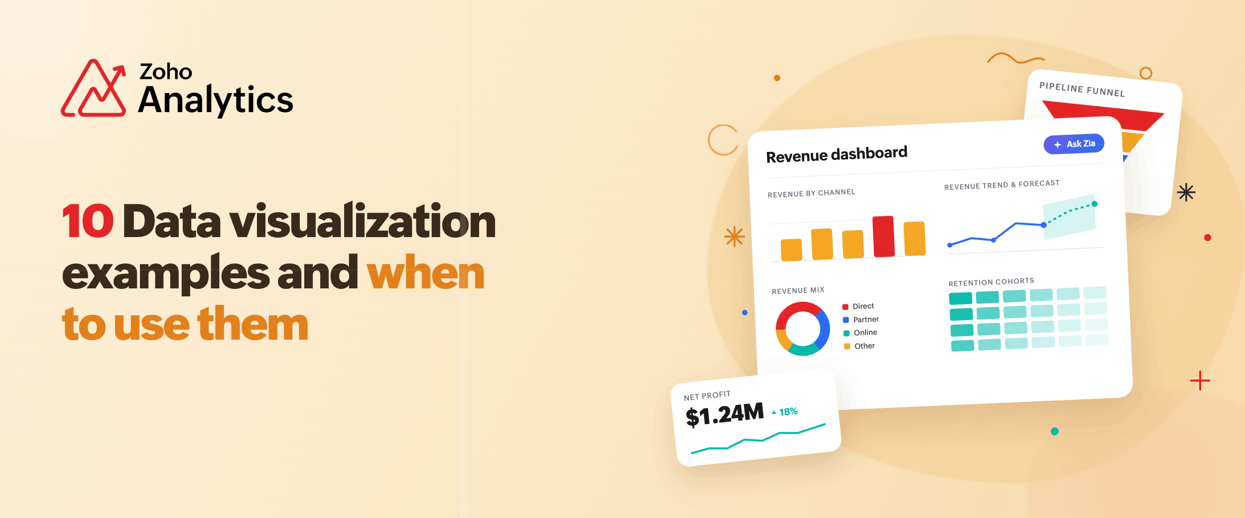
4. 50+ visualization types for real storytelling
Zoho Analytics offers over 50 chart and widget types:
- Standard visuals: bar, line, area, pie
- Advanced styles: heat maps, geo maps, bubble charts, funnel charts
- Pivot tables, KPI widgets, tabular grids
- Fully customizable dashboards: drag & drop layout, customizable themes
Combine these to build reports that not only display numbers—but tell stories.
5. Secure collaboration and sharing
Insights matter only when they reach the right people. Share dashboards across your team or externally with fine‑grained access control. Set viewer, editor, or commenter roles. Add contextual comments and annotations so your team collaborates directly in the dashboard environment. 
6. Alerts and anomaly detection
Configure data alerts that notify you when a threshold is crossed or an anomaly emerges. Stay ahead of issues, not behind them.
7. Built‑in AI with Zia
Analytics should be easy, even for non‑technical users. With Zia, our AI agent, you get:
- Ask Zia: Just ask a question, “Show me last quarter’s region‑wise sales,” and get a full report.
- Zia Insights: Receive narrative summaries of key findings from your visualizations.
- Zia Suggestions: Get smart recommendations for chart types and layouts based on your data.
8. Advanced analytics for power users
When you’re ready to go deeper, Zoho Analytics has you covered:
- Code Studio: Use SQL, Python or R to build custom logic, advanced joins and models.
- AutoML: Predict trends, build forecasts, and find outlier behavior—all with minimal setup.
Try out Zoho Analytics with a 15-day free trial. If you have any questions or need a little help figuring out how it fits your workflow, you can always book a free personalized demo.
Trusted by 20,000+ businesses. No credit card required.
Frequently Asked Questions
1. What features should data visualization software have?
Look for support for multiple data sources, customizable charts, interactive dashboards, data prep tools, collaboration options, AI insights, and scalability. These ensure faster analysis, smarter decisions, and future-proof reporting.
2. How can I visualize digital marketing performance in customizable dashboards?
Connect platforms like Google Ads, Facebook, HubSpot, or Mailchimp. Track key KPIs, use filters and alerts, build tailored dashboards for SEO, social, or paid campaigns, and automate reports to stay informed and client-ready.
3. How do I choose a platform for multi-channel data visualizations?
Choose a platform that integrates with all your tools, supports unified dashboards, allows flexible reporting, scales with data growth, and is easy for non-technical users to explore and build visualizations.
4. How do you evaluate data visualization software for enterprise vs SMB use cases?
Enterprises should prioritize governance, SSO, role-based access, and scalability across large user bases. SMBs need quick setup, affordable pricing, and self-service dashboards. Either way, start with your actual data sources and who needs the insights.
5. What are the most common mistakes when choosing a data visualization tool?
Picking a tool based on demos alone, ignoring integration gaps, and underestimating adoption. Teams often choose feature-heavy platforms their users never fully use. Always test with real data and real users before committing.
6. What technical requirements should you assess before adopting a data visualization tool?
Check your data source compatibility, volume, and refresh frequency needs. Confirm whether the tool supports your database types, cloud apps, and file formats. Also assess user authentication requirements and whether on-premise or cloud deployment fits your IT policy.
 Pradeep V
Pradeep is a product marketer at Zoho Analytics with a deep passion for data and analytics. With over eight years of experience, he has authored insightful content across diverse domains, including BI, data analytics, and more. His hands-on expertise in building dashboards for marketing, sales, and major sporting events like IPL and FIFA adds a data-driven perspective to his writing. He has also contributed guest blogs on LinkedIn, sharing his knowledge with a broader audience. Outside of work, he enjoys reading and exploring new ideas in the marketing world.