- HOME
- Ecommerce operations
- Ecommerce website design: Examples, key components and tips
Ecommerce website design: Examples, key components and tips
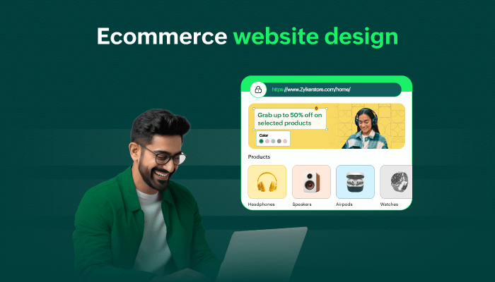
According to research studies cited by CXL, 94% of potential customers form their first impression of a website in the first 0.05 seconds based purely on its design. So, you have less than a second for your ecommerce store to make a lasting impact.
An ecommerce website refers to an online platform where businesses sell products or services. However, ecommerce website design is the strategic art and science of creating an online store to look good and function efficiently.
Everything from fonts and layouts to navigation flow and the subtle cues that signal trust to potential buyers falls under ecommerce design. Factors like those shape what customers consider the best ecommerce website design experience.
This article is for anyone looking to design an ecommerce website or someone that wants to develop their existing site's design.
5 best ecommerce website design examples for inspiration
Libas Loungewear
Ulavaranand
Thread Shop
Chola Impressions
Bamigugu
1. Libas Loungewear
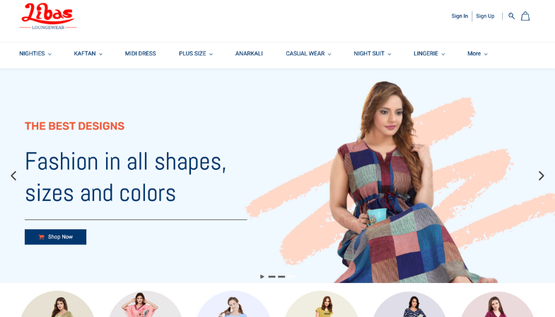
Libas Loungewear stands out because of the well-structured site navigation and effective mega menu design. The menu clearly subdivides products into familiar categories such as "Nighties," "Kaftan," and "Night Suit"—exactly how customers think about shopping for sleepwear. Rather than presenting visitors with an overwhelming number of choices at once, the mega menu gets them to the right section fast.
Visually, this website uses a soft, calming color palette that works perfectly with the nature of sleepwear and loungewear. The subtle tones make the site feel quite relaxed and inviting, yet still product focused.
2. Ulavar Anand
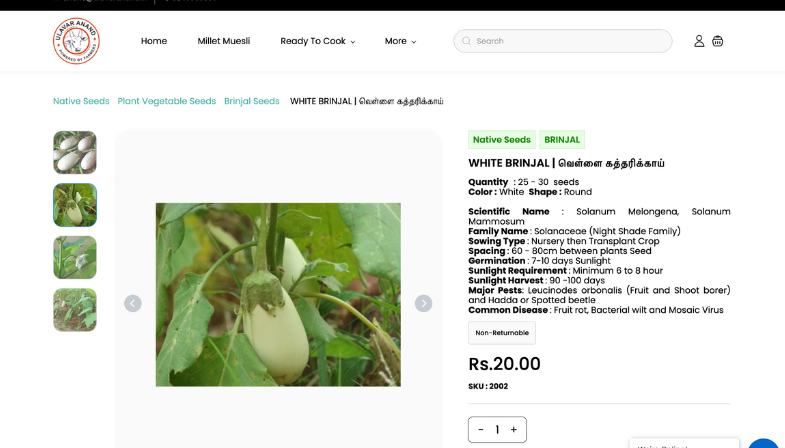
Ulavar Anand keeps a strong emphasis on the usage of real images of high quality products throughout its website. This builds up much needed validity and trust. Clear images of seeds, plants, and farm-related products helps customers understand what exactly they are purchasing.
Instead of generic stock images, the website makes use of real and product-specific visuals that reflect the brand's agricultural roots. This helps reassure customers about freshness, quality, and credibility, especially in categories as seeds and farming inputs, where trust directly influences purchase decisions.
3. Thread Shop
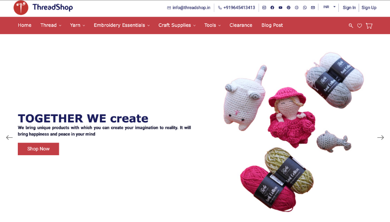
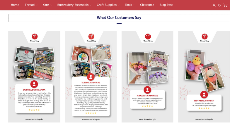
Thread Shop knows that with craft-based ecommerce, trust means when it comes to converting sales. The “What Our Customers Say” section is probably one of the most prominent elements on the site, emphasizing what actual buyers had to say.
Apart from reviews, Thread Shop builds credibility by clearly stating trust signals such as "Quality Assured," "Pan India Delivery," "High Quality Products," and alignment with current trends. These signals answer common concerns upfront, reducing confusion early in the buying journey.
4. Chola Impressions
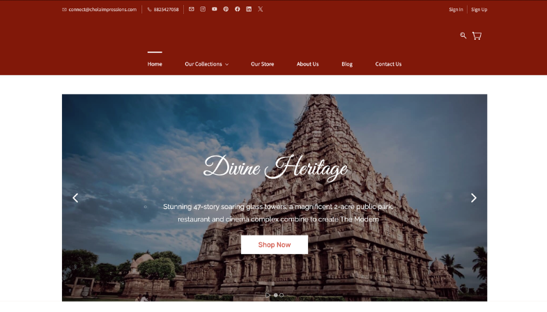
Chola Impressions demonstrate how effectively storytelling and craftsmanship-led design support premium ecommerce pricing. Rather than recognizing paintings as mere products, the website walks visitors through how each piece was done by hand, showcasing hand-painted techniques, natural pigments, gold foil work, and archival grade finishes.
The design further supports informed decision-making by clearly displaying pricing, discounts, and collection labels such as "New Arrivals" and "Antique Collections." This helps visitors sort out different artistic styles and price points without feeling lost or confused.
5. Bamigugu
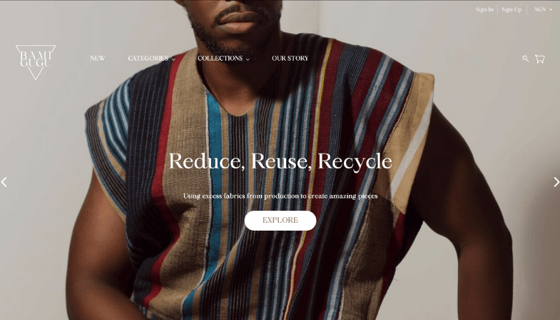
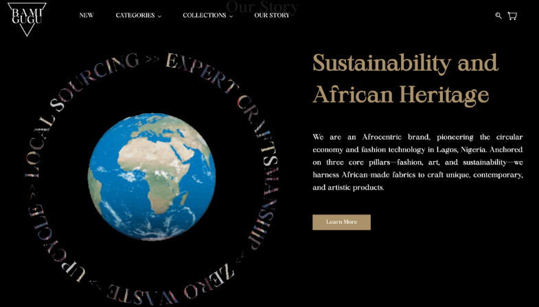
Bamigugu’s website focuses on who they are before what they sell, prioritizing their brand identity. Instead of pushing discounts or sales, it highlights the brand’s African roots, sustainable values, and commitment to a circular fashion economy.
By design, the website reinforces this positioning through strong imagery, intentional messaging, and focused collections. The result is a brand experience that attracts a more conscious and loyal audience that will invest in purpose-driven brands rather than shop purely on price.
5 key components for ecommerce website design
Site navigation
Effective site navigation should make customers feel oriented, not lost. Your navigation bar, home banner, product collections, and ads work together as a cohesive way to find things.
Key navigation elements to prioritize
Navigation bar: Keep it simple by limiting primary categories as too many categories will overwhelm customers and create decision fatigue. For example, a clothing brand might include "Men," "Women," "Kids," "Accessories," and "Sale" as they are the primary categories.
Search bar: Most mobile ecommerce sites fail to offer product browsing. A search bar should be visible at the top of every page. Make sure it's fast and suggests relevant results as users type.
Breadcrumb navigation: When customers land on a product page, they should be able to easily return to where they came from without losing their place. Use breadcrumbs like "Home > Women > Dresses > Summer Dresses" that serve as visual anchors to reduce cognitive load.
Home banner & featured collections: Make use of your hero section to promote seasonal collections, new arrivals, or bestsellers with amazing visuals and a clear call to action. This instantly tells the visitor what your store is about and dictates the initial browsing path.
Visual design
Visual design is everything you can see on a page: fonts, colors, images, animations, whitespace, and the like. It's the aesthetic that either makes customers think "this is professional" or "this feels sketchy."
Your visual design communicates something about your brand before your copy even gets a chance. People don’t judge your product first; they judge your presentation.
Typography and color: Choose fonts that are readable and reflect your brand personality; a luxury brand might use elegant serifs while a tech startup might go for clean, modern sans serifs. Colors evoke an emotion; they influence whether someone feels relaxed, excited, or trusted.
Imagery and animations: High quality product photos really matter when it comes to design. The more angles a product is viewed from, the better it is shown in real life contexts. Preferably, include a zoom feature that allows customers to take a closer look at the products.
Accessibility and inclusivity: Include alt text for every image. This isn't just good for SEO; it's essential for visually impaired users. Make sure your color contrasts meet standards set forth under WCAG so all users are able to read the text. Good design works for everyone, not just people with perfect vision.
Customer trust indicators
You can have the most beautiful website in the world, but if customers don't trust you, they won't buy. Trust indicators are the little signals that reassure visitors their money and personal information are safe.
Customer reviews and testimonials
Trust badges and security seals
Clear return policies and guarantees
Testimonials and success stories
Having everything in place will ensure your site is one customers actually trust.
Mobile-first and responsive design
Your site should automatically adapt to any screen size from mobile phones and tablets to desktops. When navigation menus automatically collapse into a hamburger icon, when images resize perfectly, and when buttons stay thumb friendly, that is responsive design at work.
Have an interface friendly to touch with buttons and links at least 48x48 pixels so they're easy to tap on without accidentally clicking on something near them. Design considerations include prioritizing the most important navigation elements and tucking secondary items behind menus.
User-friendly experience
A good design removes friction from the buying journey. Every additional click, every confusing step, every surprise hidden fee at checkout can lead to cart abandonment.
Optimize shipping information and be as transparent as possible with regards to shipping costs upfront. One of the major reasons for cart abandonment is unexpected shipping fees at the final step.
Provide multiple options for payments, as customers abandon carts when they don't see their preferred way of paying. Support payments by credit cards, digital wallets, and any other form of local payment methods relevant to your market.
How to design an ecommerce website: 6 expert tips
Keep content updated frequently
Regularly adding or updating content keeps your website fresh and relevant. Search engines reward updated content, and customers are more likely to trust stores that look active and alive.
Update product descriptions, seasonal banners, testimonials, and blog posts regularly. Even small refreshes lift traffic and engagement.
Maintain a consistent brand identity
Brand identity is one of those things that's easy to talk about but hard to maintain. When customers see your website, they should instantly recognize it as "your" brand, whether they're on a product page or your contact page.
This means consistent:
Color palettes across all pages and touchpoints
Typography and font choices
Tone of voice in your copy
Visual style in imagery and animations
Use analytics and data to improve user engagement
You can design something beautiful, but you'll only know it's working by analyzing data.
Google Analytics, Google Search Console, and platform-specific tools give you access to metrics such as bounce rates, click-through rates, conversion rates, average order value, and more. You can see where visitors are dropping off, which products are getting attention, and what devices they're using. Use this data and make changes when necessary.
Understand basic coding
You have two paths here: learn the basics yourself or outsource to the right platform or developer.
If you go the self-learning route, you don't need to become a programmer. Understanding basic HTML, CSS, and JavaScript helps you troubleshoot issues without waiting for a developer. You'll realize "oh, this small change that seemed complex actually just takes changing one value."
To make things easier, you can use drag-and-drop builders like Zoho Commerce. They eliminate the coding barrier without sacrificing customization.
Present information clearly
Most of the time, the best presentation follows a simple formula: high quality images first, then key information (price, availability, key features), then detailed descriptions, then reviews and trust indicators.
Avoid information overload. Break up text with images, use subheadings, input bullet points for specifications. If a customer has to think too hard about something, the deal is off. They'll just leave and shop somewhere else.
Use proper categorization
When you're shopping in a physical store, similar products are grouped together. Online stores should work the same way. Customers want to find products similar to what they're interested in, not be lost in an unorganized inventory.
Use natural categorization parameters that match how your customers think:
By product type (electronics, clothing, home & garden)
By customer segment (men's, women's, kids)
By price point (budget, premium, luxury)
By occasion (summer collection, holiday gifts, back to school)
By season or trends (trending now, new arrivals, sale)
Good categorization isn't just good for UX; it's good for SEO too. Category pages become landing pages for keyword phrases, and they help Google understand your site structure.
Start your ecommerce website journey
In ecommerce, the best designs come from listening to your customers, analyzing what's working, and continuously refining your approach. What matters most is that you start, focus on the fundamentals, and commit to continuous improvement.
If you're starting from scratch or redesigning an existing store, tools like Zoho Commerce make this process significantly easier. The drag-and-drop visual editor means you don't need to hire expensive developers or every small change.
What aspects of ecommerce design are you struggling with? Are you focused on improving conversions, reducing cart abandonment, or enhancing the mobile experience? Share your questions, challenges, or even your success stories in the comments below. We'd love to hear about your ecommerce journey and how you're approaching design and optimization.
