- HOME
- Best practices & Guides
- How to build multi-page forms people actually finish
How to build multi-page forms people actually finish
- Last Updated : September 23, 2026
- 80 Views
- 9 Min Read

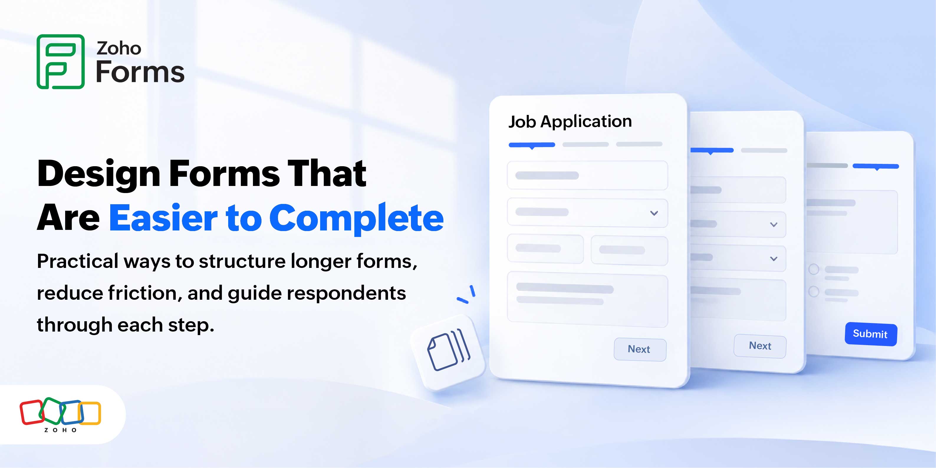
When someone clicks your link, ready to sign up, apply, or book, a long form is a wall that can stop them in their tracks. They see fifteen fields going down past the end of the page and quietly close the tab. The questions you asked were fair. The problem was how the form looked: like work.
Split that same form into a few short, clearly labeled pages and the experience changes. A progress bar shows respondents how far they've come and how little is left. Each step feels easy to complete, so more people reach the end.
What is a multi-page form?
As the name suggests, it should be a form with multiple pages. But it is more than just pages. In reality, a multi-page form (also called a multi-step, wizard, or step form) breaks one long form into several shorter pages that respondents complete in sequence, usually with a progress bar and Next/Previous navigation.
Instead of showing every field at once, you group related questions onto separate pages. Contact details might sit on page one, preferences on page two, and payment on page three. Respondents still only submit once, and you still receive a single, complete record. What changes is the perceived effort at each step.
Key takeaways
- One form with ordered pages delivered as a single submission
- Fields are grouped by topic so each page has a clear purpose
- Also known as wizard forms, step forms, or tabbed forms
Why long forms lose respondents
People abandon long forms because a full page of fields creates a sense of high effort before they have even started filling out your form. Research from the Baymard Institute consistently finds that overly long or complicated flows are among the top reasons users quit before submitting.
Your respondent's brain estimates effort from what it sees. A dense page reads as a chore, and the easiest way to avoid a chore is to leave. This is cognitive load, and it's the quiet reason many good forms underperform.
The numbers back this up. Baymard's checkout research puts the average online cart-abandonment rate near 70%, and a checkout that feels too long or too complex is one of the most common self-reported reasons people give for bailing out. Baymard also found that a typical checkout carries roughly 11 to 12 form fields, while a well-optimized flow needs only about 7 to 8.
Here's the nuance most articles miss: Baymard's testing shows the number of fields affects usability more than the number of steps. Adding pages on its own doesn't help. Multi-page forms work when they let you group, sequence, and trim what you ask—not when they just repackage a bloated form.
Key takeaways
- Long, dense forms raise cognitive load and drive drop-off.
- Baymard: ~70% average cart abandonment; long or complex flows are a top cause.
- Fewer fields help more than fewer steps organize and trim, don't just paginate.
- Collect only the data you need; explain the "why."
How progress bars and visual cues keep people moving
Progress bars and visual cues reduce uncertainty. When respondents can see "Step 2 of 4" and watch a bar fill, they know the form is finite and nearly done, which taps two well-documented psychological effects.
The first is the goal-gradient effect the finding that motivation to finish a task rises as people get closer to the goal. It traces back to Clark Hull's early research and was demonstrated in a modern consumer context by Kivetz, Urminsky, and Zheng (2006) in the Journal of Marketing Research. A progress bar makes the finish line visible, so the closer someone gets, the more they want to complete it.
The second is the Zeigarnik effect, named after psychologist Bluma Zeigarnik, whose 1927 work described how people feel a mental pull to finish tasks they've already started. Once a respondent completes page one, leaving the rest unfinished creates a small, useful tension.
You don't need every cue at once. Choose the ones that fit your form:
- A progress bar or percentage to let people see how much is left.
- A step indicator ("Step 2 of 4") paired with page titles.
- Descriptive page headings that name what each page is for.
- Short microcopy under the header to set expectations, such as "Takes about two minutes."
- Clear Next and Previous buttons to make navigating the form simple.
- Inline validation, so errors appear on the page where they happen instead of piling up at the end.
Key takeaways
- Visibility of progress reduces the anxiety that causes abandonment.
- Goal-gradient effect: Motivation climbs as the end nears.
- Zeigarnik effect: People are drawn toward completing tasks they've started.
- Combine a progress indicator, clear page titles, and inline validation.
How to build a multi-page form in Zoho Forms
Zoho Forms lets you add Page Break fields to divide your form into steps, turn on the status/progress bar, label each page, set Page Rules for conditional skipping, and enable validation before you publish.
Zoho Forms has supported multi-page forms for years, with a native Page Break field, a built-in progress/status bar, automatic Next/Previous navigation, conditional page skipping through Page Rules, and page-level validation. Here's the workflow:
- Map your fields first. On paper or a whiteboard, group your questions into logical sections. This is the single most important step.
- Build a Standard Form and add all your fields as usual with drag-and-drop.
- Add a Page Break wherever a new step should begin. Each break creates a new page in the sequence.
- Title and number each page so respondents always know where they are and what's coming.
- Turn on the status/progress bar and style it to match your theme. You can adjust the navigation button labels, colors, and shapes to guide people toward the finish.
- Add Page Rules to skip pages that don't apply based on earlier answers, so each respondent sees only what's relevant to them.
- Enable validation and preview on both desktop and mobile so mistakes are caught before someone advances. Then publish and share.
Key takeaways
- Page Break = the field that creates each step.
- The progress/status bar and Next/Previous navigation are built in.
- Page Rules skip irrelevant pages; validation runs before advancing.
- Preview on mobile before publishing.
A best-practice checklist
Here's a quick checklist of ideas to optimize your multi-page forms.
- Open with the easiest, lowest-friction question (name or email), not the hardest.
- Group fields by topic; three to six related fields per page is a sensible rule of thumb.
- Keep the total field count to the minimum you genuinely need.
- Give every page a clear title and keep the step count visible.
- Show a progress bar or "Step X of Y" on every page.
- Use inline validation and write error messages in plain language.
- Add short microcopy where a field might cause hesitation, and explain why you're asking.
- Design and test for mobile—most respondents are on a phone.
- Where the form is long or sensitive, let people save and resume.
Common mistakes to avoid
The biggest mistake is adding steps without removing friction. Pagination is not a substitute for a shorter, clearer form.
| Do | Don't |
| Split the form by logical section | Split arbitrarily just to hit a page count |
| Reduce the number of fields | Keep every field and only add pages |
| Front-load easy questions | Open with sensitive or difficult fields |
| Show progress on every page | Hide how many steps remain |
| Validate on each page | Dump every error at the final submit |
| Ask only for data you need | Collect "nice to have" data that raises drop-off and privacy risk |
Multi-page vs. Single-page vs. Card Forms
Quick answer: Use a single page for short forms (roughly seven fields or fewer), a multi-page form for longer forms with natural sections, and Card Forms when you need to focus on one question at a time for conversational or mobile-first experiences.
| Layout | Best for | Pros | Cons |
| Single-page (Standard) | Short forms, ≤ ~7 fields | Fast, one view, easy to scan | Overwhelming once it gets long |
| Multi-page | Longer forms with distinct sections | Lowers perceived effort, progress cues, Page Rules | More clicks; needs logical grouping |
| Card Forms | Mobile-first, surveys, conversational flows | Focused; one decision at a time | Slower for power users; more taps |
A simple decision path (also a good spot for a visual see below):
- Seven fields or fewer → Keep it on a single page.
- Eight or more fields with clear sections → Use a multi-page form with a progress bar.
- Mobile-first or a conversational, survey-style feel → Use Card Forms.
FAQ
1. What is a multi-page form?
A multi-page form breaks one long form into several shorter pages that respondents complete in order, usually with a progress bar and Next/Previous buttons. Fields are grouped by topic, so each page has a single clear purpose. Respondents submit once and you receive one complete record. It's also called a multi-step, wizard, or step form.
2. Do multi-page forms have higher completion rates than single-page forms?
They often do for longer forms, because showing fewer fields at a time lowers perceived effort. But this isn't automatic. Baymard's research shows the number of fields matters more than the number of steps. A multi-page form helps when it lets you group, sequence, and trim questions not when it simply spreads the same fields across more clicks.
3. Why do progress bars reduce form abandonment?
Progress bars make the finish line visible, which reduces uncertainty about how much is left. This connects to the goal-gradient effect, where motivation rises as people near a goal, and the Zeigarnik effect, where started tasks create a pull to finish. Seeing "Step 3 of 4" reassures respondents that the end is close.
4. How many fields should each page have?
There's no fixed rule, but three to six related fields per page is a sensible starting point. Group by topic rather than by count so each page feels coherent and keep your total field count as low as possible. Remember that every extra field is a chance for someone to drop off.
5. How do I add a progress bar in Zoho Forms?
Build a Standard Form, add Page Break fields to create your steps, then turn on the status/progress bar in the form settings. You can style the bar to match your theme and customize the Next and Previous button labels, colors, and shapes. Preview the form to confirm the bar displays correctly on desktop and mobile.
6. What is a Page Break in Zoho Forms?
A Page Break is a native field that marks where one page ends and the next begins. Dragging a Page Break into your form splits it into separate steps. You can add as many as you need, and each new section becomes its own page in the respondent's sequence, complete with navigation and progress display.
7. Can I skip pages based on a respondent's answers?
Yes. Zoho Forms uses Page Rules to show or hide entire pages based on earlier answers. For example, you can skip a payment page for free event tickets, or hide a references page for certain applicants. This gives each respondent a tailored path and removes questions that don't apply to them.
8. What are visual cues in form design?
Visual cues are on-screen signals that help respondents understand where they are and what to do next. Common examples include a progress bar, a step counter, descriptive page titles, section headings, clear buttons, and inline validation. Used well, they reduce confusion and keep people moving toward submission.
9. Are multi-page forms good for mobile?
Yes, when designed for it. Shorter pages suit small screens better than one long scroll, and a progress bar reassures mobile users on slower connections. Test every page on a phone, keep tap targets large, and consider Card Forms, which present one question at a time, for a mobile-first, conversational feel.
10. What's the difference between a multi-page form and a Card Form?
A multi-page form groups several related fields onto each page. A Card Form shows one question at a time in a focused, conversational style. Multi-page suits longer forms with clear sections; Card Forms suit surveys and mobile-first flows where you want each question to have the respondent's full attention.
11. Should I use a multi-page form for a short form?
Usually not. For roughly seven fields or fewer, a single page is faster and lets people see the whole task at once. Multi-page layouts pay off when a form is long enough that a single view would feel overwhelming, or when the questions fall into distinct, logical sections.
12. How do I reduce form abandonment?
Ask for less, and make what remains feel manageable. Trim optional fields, group questions into short steps, show progress, front-load easy questions, and validate errors inline. Explain why you need sensitive information. Then measure per-page drop-off so you can find and fix the exact step where people leave.
13. Can respondents save a form and finish later?
Enable this option for longer or sensitive forms to let people save and resume without losing progress when they need to gather information. This is especially useful for applications and quotes that require documents.
14. What metrics show whether my multi-page form is working?
Watch completion rate, per-page drop-off, average completion time, and field-level abandonment. Completion rate tells you the overall result; per-page drop-off pinpoints the weak step; completion time can reveal confusion. Zoho Forms' reports surface these so you can improve based on real respondent behavior.
15. Does adding more steps ever hurt completion?
Yes. Extra steps that don't reduce the actual work add friction and clicks without benefit. Baymard's research is clear that field count drives usability more than step count. Shorten your form and only add pages to organize, not as a substitute for removing unnecessary fields.