- HOME
- Design & deliver
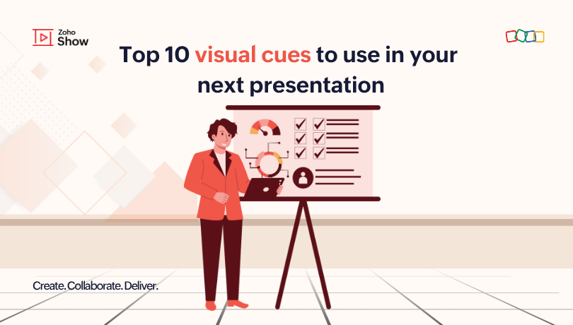
- Top 10 visual cues to use in your next presentation
Top 10 visual cues to use in your next presentation
- Last Updated : July 29, 2025
- 279 Views
- 5 Min Read
Our brains may be wired for complexity, but when it comes to learning, simple visuals are often the most effective. Researchers have demonstrated that about 65% of humans are visual learners. People remember what they see more than what they read, and visual information tends to stay in their memory for the long term.
Imagine you are scrolling through a product brochure or even a web comic; your attention pauses briefly whenever a striking visual grabs your eye, doesn't it? That's because we all have an instinct to focus when there is a visual representation of something interesting.
What is a visual cue?
A visual cue is any design element such as colour, shape, symbol, image, animation, or layout that helps direct the audience’s attention, understanding, or action. It simplifies the presentation by using visuals to communicate ideas quickly and effectively.
Why are visual cues important for your presentation?
Whether you are presenting important updates at a board meeting or pitching a new idea to your investors, visual elements in a presentation matter a lot. They make your slides effective, visually stunning, and support your story telling.
A text-heavy presentation can overwhelm your audience and make it harder for them to stay engaged. To convey your message effectively, a presentation should include both text and supportive visual elements. These elements help the audience understand your carefully crafted slides. Additionally, they simplify comprehension, improve recall, and enhance the overall flow of the presentation.
Let’s review some of the most useful visual cues that can strengthen your presentation’s structure and simplify the content.
Arrows and shapes
Arrows are great for visually connecting elements on a slide to make it easier for your audience to understand relationships and the flow of information. Use them to indicate the progression of a process or to show a series of steps; this helps simplify complex procedures and keeps the sequence clear.
Shapes like circles, rectangles, or callouts help highlight important details. They can be used to spotlight key numbers, terms, or specific sections in your slides, drawing attention where it matters most.
For example, picture yourself presenting your board members with a quarterly report deck and talking about the company revenue. You can use arrows to show trends in high and low performance and highlight your profit figures with a circle so that everyone can grasp the key points instantly.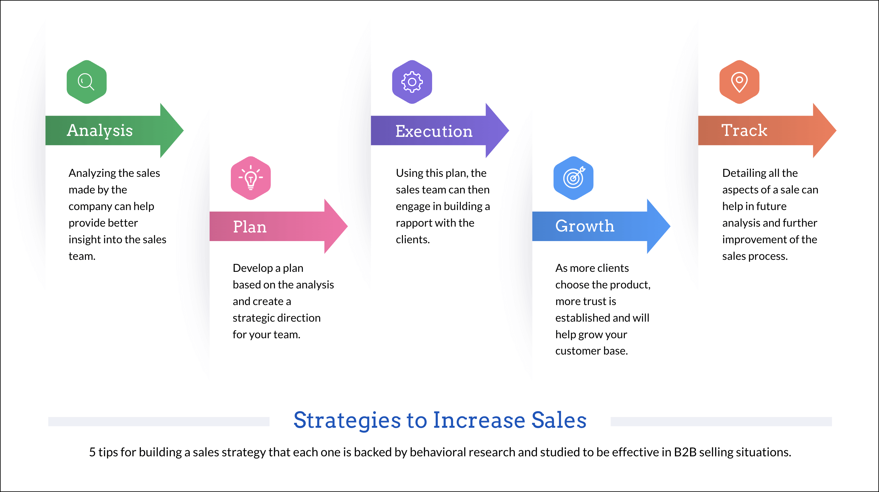
Colors and highlights
Color plays a powerful role in how information is received and remembered. Studies show that color can boost readership by 40%, learning by up to 78%, and comprehension by 73%. Applying color to shapes, charts, tables, or text boxes can direct attention and enhances clarity.
Highlights are a simple yet effective way to emphasize specific words or phrases. Whether you're marking key takeaways, important figures, or action items, highlights help guide your audience's focus.
In educational presentations, thoughtful use of colors and highlights improves readability, increases memory retention, and keeps learners engaged in a more effective way.
Icons and illustrations
Icons and illustrations play a key role in making your message visually expressive and memorable. Icons often communicate information more effectively than text, making presentations more concise and impactful. Use icons that align with your message to guide the audience's attention and reinforce the structure of your content.
For instance, imagine you're pitching your product to an investor and outlining its key benefits. By using relevant icons alongside each point, you make it easier for them to understand quickly and retain the information. A lightning bolt icon can instantly communicate the product's fast performance, while a lock symbol reinforces the idea of strong data security.
But what if you’ve created an exceptional presentation, and your audience doesn’t connect with it? Illustrations add a personal touch to your slides that helps your message resonate more effectively. It also reflects your brand’s identity, values, and tone of voice. If you are preparing a presentation for healthcare, utilizing doctor illustrations to showcase your mission, pain points, and the solution will convey your purpose in an elevated way.
Tables and charts
Data is crucial for any presentation. A presentation filled with numbers and unclear data will not impress your stakeholders. They need metrics to be organized or visualized so they can understand their revenue, budget, and profit. Tables and charts help by presenting the information in a structured way.
For example, tables in a deck showing sales results can provide rapid side-by-side comparisons that make it simple for stakeholders to notice irregularities and monitor advancement. They also condense large volumes of data into a readable format, improving clarity and aiding informed decision-making.
Similarly, charts are visual representations of data that make it easier to interpret patterns, trends, and comparisons at a glance. They transform raw numbers into clear visuals. In a marketing report, a chart visually highlighting a drop in signups conveys the trend much more effectively than just saying the numbers.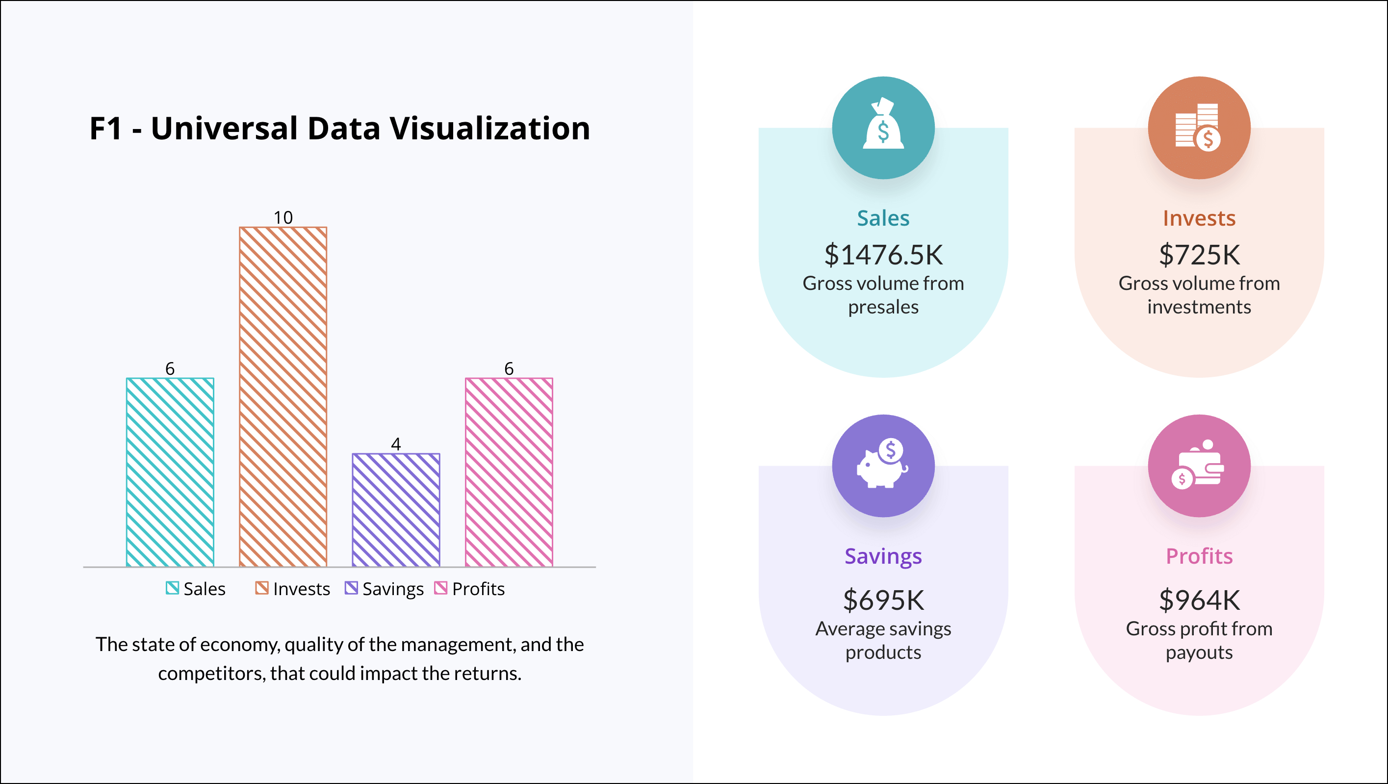
Animations and transitions
Have you ever felt out of sync with your audience during a presentation? It may be due to a difference in perspectives. This is why you may want to use animations and transitions to bring your audience back to the narrative and add an interesting element to your presentation.
Animations are visual effects applied to elements like text, images, or shapes within a slide. They help you spotlight key points, simplify concepts, and establish a visual hierarchy. Just be careful not to go overboard; too many animations can overwhelm your content.
Transitions, on the other hand, are visual effects applied between slides. When used appropriately, transitions enhance the flow of your presentation and make it more visually appealing. They guide the audience smoothly from one idea to the next, maintaining clarity and narrative continuity. For example, a simple fade transition can indicate a shift in topic and help the audience prepare for what's coming next.
Final thoughts
A presentation's success can't be measured solely on the quality of its content—its impact on your audience and their comprehension of the material are more important. So, next time you design a presentation, remember—visual cues aren’t just decoration. They help your audience follow along, stay engaged, and understand your message faster.
Zoho Show offers all the visual cues listed above to aid you in designing a presentation that simplifies content, adds visual appeal, and helps audiences understand information more effectively.
Happy presenting!