What is a business intelligence dashboard?
A business intelligence dashboard is a single-screen view of your key business metrics, built from data pulled across multiple sources. It uses charts, graphs, tables, KPI tiles, and maps to represent numbers in a format people can actually read and act on, without waiting for someone to compile a report.
The difference between a dashboard and a static report is interactivity. You can filter by time period, drill down from company-level revenue to individual sales rep performance, or toggle between regions, all without touching the underlying data. The dashboard updates as your data does.
BI dashboards connect directly to your CRM, ERP, marketing platforms, databases, and cloud apps. Once connected, they pull data on a schedule or in near real-time, so the numbers you're looking at reflect what's actually happening in the business.
Why is a BI dashboard important?
Think of how a car dashboard works. Speed, fuel level, engine temperature. All the information you need to make decisions while driving, laid out in front of you. You don't stop to run a report before deciding whether to slow down or pull over for fuel.
BI dashboards apply the same idea to running a business. Without them, decision-makers work from incomplete pictures, pulling numbers from different tools, waiting on the data team, or making judgment calls without evidence. That creates lag, and lag costs money.
The numbers back this up.
- Data-driven organizations are 23 times more likely to acquire customers than their peers - McKinsey.
Here are the top 5 benefits you'll get while implementing self-service BI dashboards at your organization:
Access all relevant metrics in one place
Organizations can consolidate and access all relevant metrics in a single, centralized location. With a well-designed BI dashboard, an executive or CEO can easily monitor key business metrics, such as sales figures, website traffic, customer tickets, and satisfaction rate, without navigating to different apps and sheets. When all essential metrics are readily available, decision-makers gain a comprehensive view of their data in an intuitive format and make informed decisions.
Get real-time insights
Dashboards connected to live data sources offer real-time insights to organizations, enabling stakeholders to make decisions based on the up-to-the-minute data. Tracking real-time data, including monitoring inventory levels, website analytics, and marketing campaigns, empowers organizations to make decisions swiftly and address emerging challenges proactively.
Uncover trends and predict problems earlier
With BI dashboards able to visualize data, stakeholders can uncover patterns, trends, correlations, and anomalies, which is impossible with raw data. With predictive analytics, organizations can forecast problems earlier, avoid costly mistakes, optimize operations, and maintain a competitive edge.
Democratize data
In general, accessing and interpreting complex data was limited to data analysts and IT professionals. However, BI dashboards democratized data for users across the organization. Non-technical users can access, explore, and interpret data independently and efficiently with BI dashboards. This data democratization creates a data-driven culture across the organization.
Make better decisions
The most significant benefit of implementing BI dashboards is making better business decisions. By consolidating data in one place, providing real-time insights, uncovering trends, and democratizing data, BI dashboards offer the necessary information for organizations to make effective decisions.
So, with the help of business dashboards, organizations can understand what's going on, where they are on the set goals, what measures they need to take to reach the goals, and more.
Key characteristics of BI dashboards
Effective BI dashboards are usually built with key capabilities in mind, enabling end-users to get full value from their data. These critical features include:
Connectivity: A useful dashboard pulls data from where your work actually lives: your CRM, your ERP, your marketing stack, your database. Without broad, reliable data connectors, you're building on an incomplete picture.
Visualization variety: Different questions need different charts. Revenue trends belong in line charts. Regional performance belongs on a map. Quota attainment is clearest in a gauge or progress bar. A good BI tool gives you the flexibility to match the visual to the question.
Interactivity: Interactive data visualization features like filters, drill-downs, and date range selectors let users investigate a number without asking someone else for a new report. This is what separates a dashboard from a screenshot.
Role-based access: A sales rep and a CFO don't need to see the same things. BI dashboards should let you tailor the view by role, team, or seniority, showing people what's relevant to them without exposing data that isn't.
Collaboration: Comments, annotations, and sharing options let teams discuss what they're seeing in context, rather than forwarding screenshots through email chains.
Mobile BI: Executives aren't always at their desks. An executive dashboard that only works well on a desktop misses half the value.
BI dashboards vs BI reports
Despite serving overlapping purposes, BI dashboards and BI reports have their own distinctions and utilities, that can be understood better with a quick comparison:
BI dashboards: Dashboards provide a complete, holistic picture with KPIs offering a quick overview and detailed reports that provide a broader view. KPI dashboards are largely used by top-level executives and also mid-level managers to monitor outcomes and performance over any given time period
BI reports: Reports are purposed for detailed presentation of insights more often for serving real-time needs. They are used by managers at operational level to track their projects and teams on a daily basis. Use a BI reporting tool like Zoho Analytics to effortlessly create reports.
BI dashboard examples
Here are common types of BI dashboards organizations use across departments.
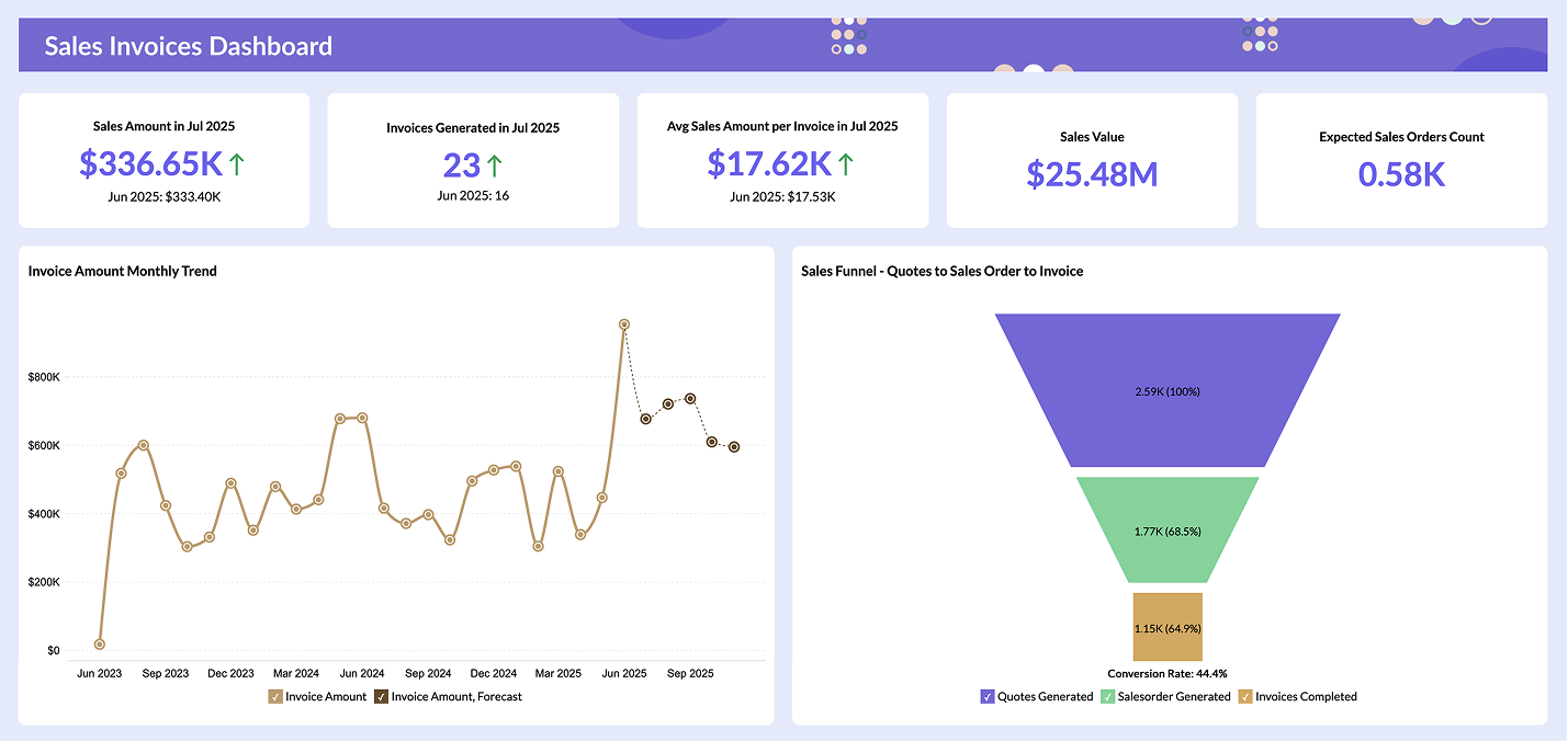
Sales BI Dashboard
A sales dashboard tracks pipeline health, quota progress, win rates, and revenue by rep or region. Sales analytics can help sales managers spot where deals are stalling, which reps are close to quota, and whether the team is on track to hit the month's number. Instead of waiting for end-of-week reports, they can see where things stand any time they need to.

Explore sample sales dashboards →
Marketing BI Dashboard
Marketing teams deal with data spread across five to fifteen platforms: Google Ads, LinkedIn, email, website analytics, and many more. A marketing dashboard consolidates campaign performance, cost-per-lead, channel attribution, and conversion rates into a single view. With marketing analytics, marketing leads answer questions like: which channels are actually producing pipeline, and which ones are burning budget.

Explore sample marketing dashboards →
Finance BI Dashboard
A finance dashboard gives CFOs and finance teams a live view of cash flow, revenue, expenses, and budget vs. actuals. Finance analytics shortens the monthly close cycle by making financial data accessible without requiring someone to manually pull reports from accounting software. When the numbers update automatically, the time spent on data prep drops significantly.

Explore sample finance dashboards →
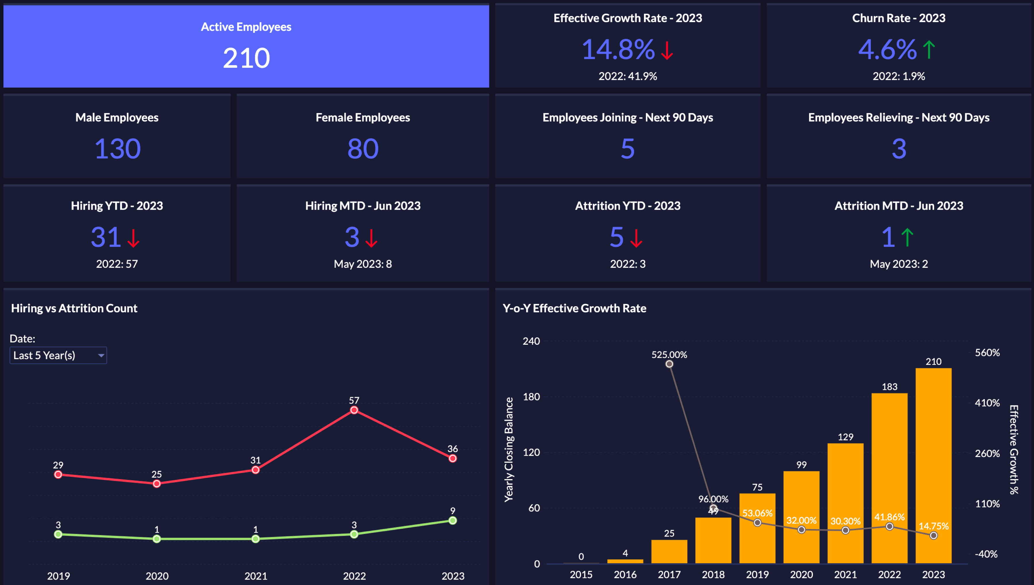
HR BI Dashboard
HR teams use BI dashboards to monitor headcount, attrition, time-to-hire, and employee performance across departments. Using HR analytics, leaders can catch attrition risk before it becomes a problem, identify where recruiting effort is paying off, and track engagement trends over time.
Explore sample HR dashboards →
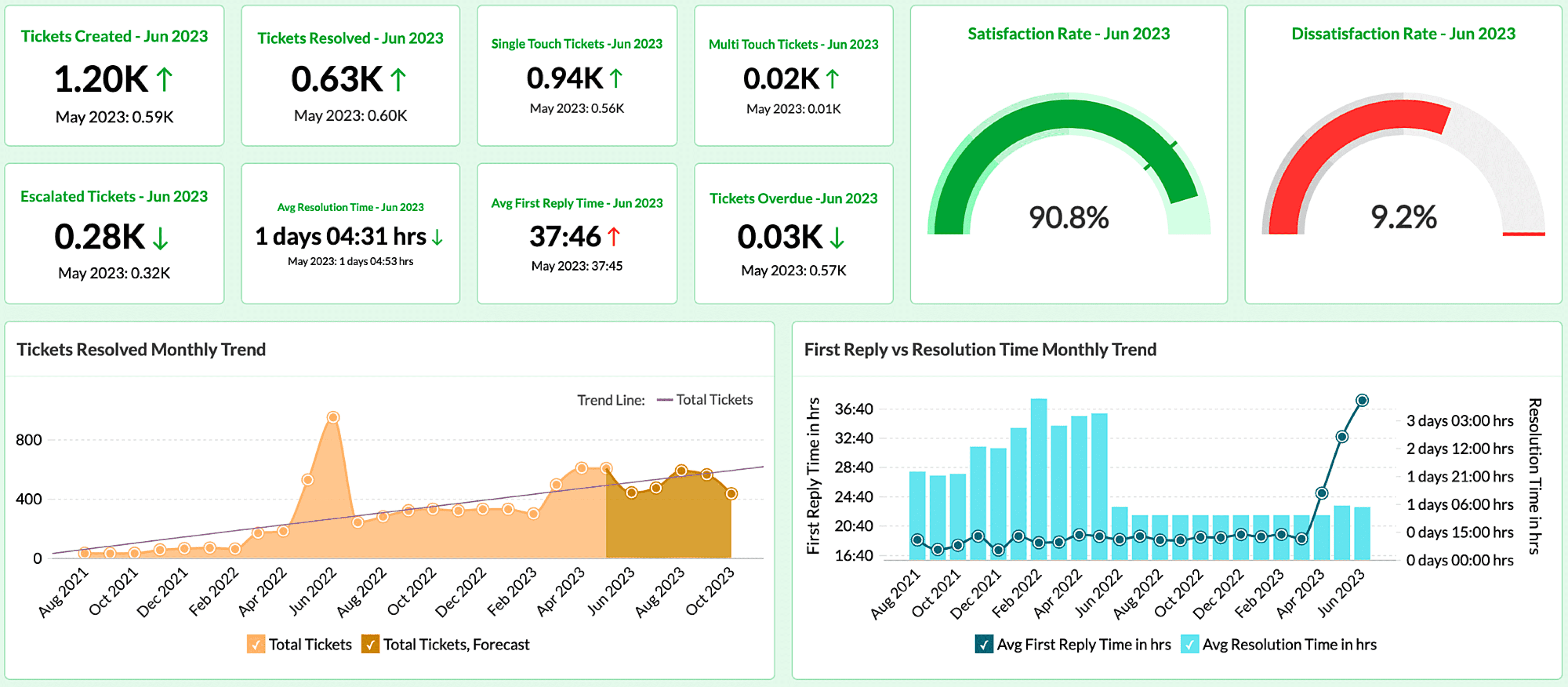
Helpdesk BI Dashboard
Support teams use BI dashboards to track ticket volume, first response time, resolution time, and customer satisfaction scores through helpdesk analytics. A helpdesk dashboard shows where the queue is building, which agents are handling the highest load, and whether SLA targets are being met, before a customer complaint makes it to a leadership conversation.
Explore sample helpdesk dashboards →
Browse more dashboard examples across departments to see how teams structure their views.
How to create a business intelligence dashboard in 8 easy steps?
What metrics should you be tracking right now? Which data sources are you going to connect? How do you make sure someone other than you knows how to read the dashboard once it's live? This section answers all of them.
- Step 1: Define the decisions, not just the metrics
- Step 2: Involve stakeholders before you build anything
- Step 3: Identify and connect your data sources
- Step 4: Clean and prepare the data
- Step 5: Choose the right BI tool for your team
- Step 6: Build the visualizations
- Step 7: Organize the layout
- Step 8: Share, measure, and iterate
Step 1: Define the decisions, not just the metrics
Someone opens their BI tool, starts dragging in fields, and ends up with 30 charts that show everything but answer nothing.
The better starting point is a decision. Not "what data do we have?" but "what question does someone in this organization need to answer regularly, and what would they do differently if they had the answer in front of them?"
A sales manager needs to know whether the team will hit quota this quarter so they can reallocate focus or escalate deals to leadership in time. That single decision drives the metric list: current pipeline value, average deal velocity, quota attainment by rep, stage conversion rate. Everything else is secondary.
Write down the three to five decisions the dashboard's intended audience makes on a weekly or monthly basis. For each decision, write the specific question they need answered and the action they would take based on different answers. That list becomes your metric specification before you touch the tool.
Step 2: Involve stakeholders before you build anything
The person building the dashboard and the person using it rarely have the same understanding of what matters. Getting that gap on the table before you start saves significant rework later.
Run a 30-minute conversation with each primary user type. Ask: what are you currently doing to track this? Where does the data you need actually live? What would make you open this dashboard on a Monday morning? Use those answers to validate your Step 1 decision list before you proceed.
Pro tip: When leadership actively uses the dashboard themselves, the rest of the team follows. Getting an exec to reference it in a meeting is more effective for adoption than any amount of training.
Step 3: Identify and connect your data sources
Before you build anything, map out where your data actually lives and whether your BI tool can reach it reliably.
For most organizations, business data is spread across five to eight systems. CRM data in Salesforce or Zoho CRM. Financial data in QuickBooks, Xero, or an ERP. Marketing data in Google Analytics or HubSpot. Support data in Zendesk or Zoho Desk. A dashboard that only pulls from one of these tells an incomplete story.
Two things to do here. First, list every data source that contains information relevant to your Step 1 decisions. Second, confirm that your BI tool can connect to each one and that the connection method, whether live query, scheduled sync, API, or flat file import, fits your refresh requirements.
What to check early: Whether your data sources use consistent identifiers. If your CRM uses customer IDs and your finance tool uses account numbers, joining those datasets requires a mapping layer. Catching that before you build avoids a painful rebuild later.
Step 4: Clean and prepare the data
This is where dashboard projects lose time, and where skipping shortcuts comes back to hurt you.
Raw data from business systems is rarely dashboard-ready. Sales reps enter customer names inconsistently. Dates are formatted differently across systems. Revenue in the CRM doesn't match the finance system because one includes refunds and the other doesn't.
The work here is data cleaning, that is to remove duplicate records, standardize field formats, resolve conflicting values across sources, and document how each metric is calculated. That last part matters more than most teams expect. When a sales manager and a CFO argue about whether revenue is up or down, they're usually looking at two different definitions of the same word. A simple metric definition document resolves that before the dashboard goes live.
Important: Clean data before you build. A dashboard built on messy data erodes trust fast, and once people stop trusting the numbers, they stop opening the tool.
Step 5: Choose the right BI tool for your team
The best dashboard software is the one your team will actually use. Tool selection often goes wrong when it prioritizes feature lists over the actual technical skill of the users.
A platform requiring SQL for custom calculations works well for a dedicated analyst team. It fails for a marketing manager or a regional sales director who just needs to see their numbers. The gap between what the tool can do and what your people can do in the tool is where most BI investments under-perform.
Evaluate on four things:
- How easy it is for non-technical users to build and read reports
- Whether it connects to the data sources from Step 3
- Total cost of ownership including view-only licenses and data volume charges
- Whether it supports your deployment preference, cloud, private cloud, or on-premises.
Run a two-week trial with your real data and real users. Have a few intended end-users try to build a simple report without help. Their experience tells you more than any feature comparison document.
Related read: Guide on how to choose the right BI tool
Step 6: Build the visualizations
With your decisions defined, data connected and cleaned, and tool selected, the actual build is more straightforward than it sounds.
Chart type should match what the data is communicating. Trends over time use line charts. Comparisons between categories use bar or column charts. Geographic distributions use maps. Performance against a target uses gauges or bullet charts. When in doubt, simpler is better. A clean bar chart is almost always clearer than a stacked or combined data visualization.
Read our guide on choosing the right data visualization type.
Build one metric at a time and test each one before adding the next. For each metric, decide what chart type represents it best, what time period it should default to, what filters it should support, and whether it needs a target line or benchmark to give the number context.
Note: Avoid building one dashboard to serve both executives and operational teams. Strategic views for leadership need four to six high-level KPIs with drill-down capability. Operational views for team leads need more granular detail. One size rarely fits both.
Step 7: Organize the layout
Put the most important metrics at the top. Group related charts together. Labels should be clear enough that no one needs to hover to understand what they're looking at. Use color to communicate, not decorate. Red for below target, green for on track, neutral for context.
A simple layout structure that works:
- Row 1 for summary KPIs, the three to five numbers that answer the main question.
- Row 2 for trend charts showing those numbers over time.
- Row 3 for supporting breakdowns by region, team, product, or campaign.
Everything else goes in a secondary view or drill-down.
Before you publish, show the dashboard to someone not involved in building it. Give them 10 seconds, then ask what's the main thing this is telling you? If they answer correctly, the layout is working.
Step 8: Share, measure, and iterate
User feedback in the first month is more useful than any pre-launch testing. The questions that don't surface during development always come up once people use the dashboard daily. Set a 30-day review with your key stakeholders after every launch.
Iteration is not a sign the first build was wrong. It's how dashboards go from functional to actually useful.
Best practices to follow while creating BI dashboards
Focus on one audience per dashboard. A dashboard built for the CEO and one built for a sales manager serve completely different purposes. Trying to satisfy both on the same screen usually satisfies neither.
Keep the metric count low. Dashboards with fewer, more relevant KPIs get higher adoption. If a metric doesn't inform a decision, it probably shouldn't be on the dashboard. A practical target is 5 to 10 key metrics per view.
Use data storytelling intentionally. Context makes numbers useful. A revenue drop means something different if you also show that it followed a planned price increase. Add trend lines, benchmarks, and annotations where they add clarity.
Clean your data before you publish. A dashboard built on inconsistent or duplicate data erodes trust faster than any design flaw. Once people stop trusting the numbers, they stop using the tool.
Test with real users before you finalize. What makes sense to the person who built the dashboard isn't always what makes sense to someone seeing it for the first time. A brief usability check before rollout saves a lot of revision cycles afterward.
Watch the webinar: 5 key best practices for building informative analytics dashboards. Watch Now
BI dashboard tools and comparison
There are dozens of BI tools on the market, but most evaluation conversations come down to the same three names. Here's a clear look at each.
Zoho Analytics
Zoho Analytics takes a different approach than Tableau and Power BI, which are built assuming you have a data team. Zoho Analytics is built for the business user who needs answers without waiting on one.
It connects to 500+ data sources, includes an AI assistant (Zia) that answers plain-English questions with charts and summaries, and pricing starts at $8/user/month with everything bundled. No separate charges for sharing, embedding, or AI features. Deployment is flexible: cloud, private cloud, or on-premises.
"With Zoho Analytics, the time spent in creating charts, reports and dashboards went down by 50%. More importantly, our software expenses were reduced by 30%!" - Moises Ochoa, Application Engineer, Cementos Progreso
Best for: Organizations that need full-featured dashboard software without the complexity or pricing of enterprise platforms.
Tableau
Tableau handles complex datasets well, supports an extensive range of chart types, and in the hands of a trained analyst it is a genuinely capable platform.
The practical limitation is that it requires trained analysts to get value from. Most business users end up submitting requests to the data team rather than building anything themselves. Pricing reflects the enterprise positioning: Creator licenses at $75/user/month, Explorer at $42, and Viewer roles at $15. For a 25-person analytics team, the cost sits between $20,000 and $25,000 per year before add-ons, training, or infrastructure.
"Empowers Data Insights with Ease, But Pricey" - Ayush K. (Source: G2.com)
Best for: Organizations with a dedicated BI team, complex visualization requirements, and budget that reflects both. If those constraints don't fit, a Tableau alternative built for business users may be a better match.
Microsoft Power BI
Power BI's main advantage is that if your organization runs on Microsoft 365, you probably already have access to it, and it already connects to everything your team uses.
The limitations are equally specific. Step outside the Microsoft ecosystem and friction builds fast. DAX, Power BI's formula language, has a real learning curve. The desktop app is Windows-only, which creates issues for Mac users and adds IT overhead.
At $14/user/month for Pro, it's one of the accessible entry points, though teams outside the Microsoft ecosystem often look at a Power BI alternative for broader compatibility.
"Powerful Data Visualization with Integration Perks, But Steep Learning Curve" - Tasneem M. (Source: G2.com)
Best for: Organizations running on Microsoft 365 looking for a direct path from Excel into proper dashboards.
Comparison Table
Feature | Zoho Analytics | Tableau | Power BI |
Starting price | $8/user/month | $15/user/month (Viewer) | $14/user/month (Pro) |
Free trial | Yes, 15 days | Yes | Yes (limited) |
AI-powered insights | Yes (Zia) | Yes (Pulse, Einstein) | Yes (Copilot) |
Data connectors | 500+ | 100+ | 100+ |
On-premises option | Yes | Limited (Tableau Server) | Yes |
Ease of use for non-technical users | High | Low | Medium |
Pricing transparency | Simple, bundled | Complex (multi-tier) | Moderate |
Best for | All types of organizations | Enterprise BI teams | Microsoft-heavy orgs |
Why choose Zoho Analytics for BI dashboards?
Most BI tools are designed for data teams. Zoho Analytics is designed for the people who actually need the answers: the sales manager tracking quota, the marketing lead reviewing campaign spend, the CFO who wants to see cash flow without sending a request to finance.
The pricing is transparent. At $8/user/month, it's one of the most affordable full-featured BI platforms available, and there are no separate charges for sharing dashboards, embedding reports, or using the AI assistant. Compared to enterprise tools where a 25-user team costs $20,000 or more per year, the cost difference is significant.
Setup also doesn't require IT. You can connect your data sources, build your first dashboard, and share it with your team in hours. The drag-and-drop interface handles most use cases without any SQL or technical configuration. If you want to build dashboards for your clients, you can also make use of embedded analytics to build and share dashboards with your clients under your brand.
Ask Zia, the built-in AI agent, lets you ask questions in plain English and get charts and summaries instantly.
"With Zoho Analytics, the ability to visualize things became easy. Most of my managers now use Zoho dashboards and quickly create reports themselves. Its usability features, like easy drag and drop filters and drill down options, are top-notch." - Daniel Franey, Director and Shareholder, Courier Logistics Limited
Common questions related to BI dashboards
What is a business intelligence dashboard?
- A business intelligence dashboard is a single-screen view of your key business metrics, pulled from multiple data sources and updated automatically. It replaces manual report-pulling with a live, interactive view your whole team can access.
What makes a good BI dashboard?
- A good BI dashboard answers a specific question for a specific audience. It shows the fewest metrics needed to support a decision, loads fast, and gets used regularly. If people are not opening it, something in those three areas is off.
How do BI dashboards differ from reports?
- Reports are static snapshots, usually built for a specific moment or meeting. Dashboards update continuously and let users filter, drill down, and explore on their own. Reports answer a question once. Dashboards answer it every time you need it.
Which tools are best for BI dashboards?
- It depends on your team. Zoho Analytics works well for business users who need full-featured BI without depending on a data team to build or maintain it. Tableau suits organizations with dedicated analysts. Power BI fits teams already on Microsoft 365.
How many metrics should a BI dashboard show?
- Less than you think. Most usability research points to 5 to 10 key metrics per dashboard. More than that and people stop reading it as a dashboard and start treating it like a spreadsheet.
Do I need technical skills to build a BI dashboard?
- It depends on the tool. Platforms like Tableau require significant technical training for anything beyond basic reports. Tools like Zoho Analytics are built for non-technical users. A drag-and-drop interface, pre-built connectors, and an AI assistant mean you can build a functional dashboard without any IT help.
Can BI dashboards pull data in real time?
- Most modern tools support real-time BI, offering data refresh depending on the source and configuration. Truly live, direct-query connections are available on higher tiers of most platforms but add complexity and cost. For most business reporting needs, scheduled sync is sufficient.
Is BI software expensive?
- BI software ranges considerably. Enterprise platforms like Tableau can run $20,000 or more per year for a mid-sized team. Zoho Analytics starts at $8/user/month with everything included. The right answer depends on team size, technical requirements, and how many people will actively use the tool.
Is there a free BI dashboard tool available?
- Yes. Zoho Analytics offers a free plan that lets you build and share BI dashboards with up to two users. Paid plans unlock more data sources, users, and advanced features like AI-powered insights and white-labeling.
How accurate are BI dashboards?
- Accuracy depends on your data quality and how your metrics are defined. When connected to live data sources with proper validation in place, BI dashboards reflect real-time business performance reliably, making them a dependable foundation for operational and strategic decisions.
What are examples of tools to create BI dashboards?
- Popular BI dashboard tools include Zoho Analytics, Tableau, Microsoft Power BI, Looker, and Qlik Sense. Each varies in ease of use, pricing, and scalability. Zoho Analytics stands out for its breadth of integrations, built-in AI, and competitive pricing.
How do you make a BI dashboard?
- Start by defining the goal and identifying your data sources. Connect them to your BI tool, build the underlying reports, then arrange charts and KPI widgets into a dashboard layout. Most modern tools, including Zoho Analytics, require no coding.
What are the important benefits of a BI dashboard?
- BI dashboards give teams a single view of business performance, surface trends that raw data hides, support faster decisions, and make analytics accessible to non-technical users. They replace scattered spreadsheets with one always-updated, interactive source of truth.
What are the key features of BI dashboard tools?
- Look for drag-and-drop report building, support for multiple data sources, real-time data sync, interactive filters, role-based access controls, and AI-driven insights. Mobile accessibility and embedding options are also worth prioritizing depending on how your team consumes data.