- HOME
- BI & Analytics
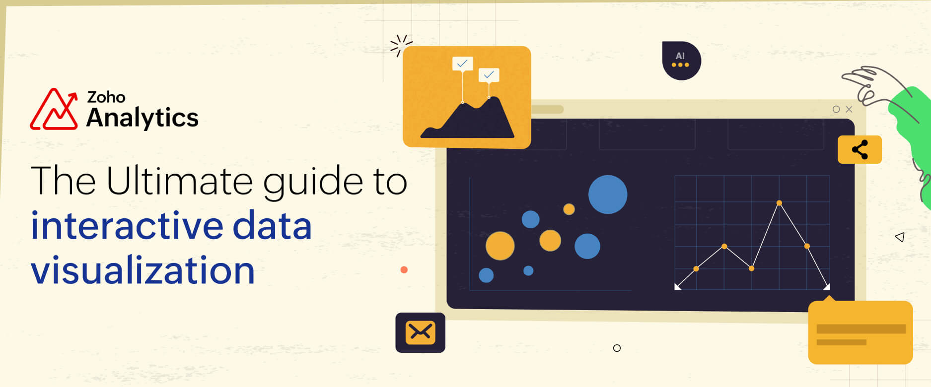
- Create Stunning Interactive Data Visualizations in Minutes
Create Stunning Interactive Data Visualizations in Minutes
- Last Updated : June 3, 2026
- 2.2K Views
- 15 Min Read
Data visualization has been evolving for quite some time, and interactive data visualization is not breaking news.
With the current breakneck pace of business, just showing data in pretty data visualization isn’t cutting it anymore. To make smart decisions, we have to understand and extract key insights from complex datasets.
That's where interactive data visualizations come into play. Interactive data visualization refers to the dynamic representation of data that allows users to engage directly with visual elements to enable deeper exploration and analysis.
Unlike static visualizations, interactive data visualizations let you engage with the data. You can explore connections, dig into relationships, and uncover insights that a static chart simply can’t reveal.
What is interactive data visualization?
Interactive data visualization is the process of representing data graphically while allowing users to interact with and explore the information dynamically. It allows users to engage directly with visual elements to explore, analyze, and interpret the information.
At its core, interactive data visualization transforms raw data into an intuitive format that encourages exploration and storytelling.
Instead of just looking at a static bar chart showing sales data, imagine:
- Drilling down into specific time periods to see what was happening month by month.
- Filtering by product categories or regions to get tailored insights.
- Hovering over individual data points for detailed metrics that weren’t obvious at first glance.
Feel free to explore the report by hovering over it, applying filters, and drilling down into data points. It's fully interactive.
This level of interactivity makes the data exploration process not only more engaging but also more insightful, letting users interact with visualizations and draw conclusions.
Static vs interactive data visualizations: Comparison
Do businesses really need to ditch static visualizations? Let's compare and find out.
| Interactive data visualization | Static data visualization | |
| User interaction | Allows users to interact with data (e.g., filtering, drilling down, hovering, and more). | Shows users fixed visuals that display data in a predefined format. |
| Real-time updates | Can display live data updates or reflect changes immediately with real-time data visualization. | Requires manual updates to incorporate new or changing data. |
| Clarity | Makes complex datasets easier to understand through tailored exploration. | May lead to information overload if the dataset is large or complex. |
| Decision-making | Facilitates faster, data-driven decisions. | Provides a general overview but may require additional analysis for decisions. |
| Use cases | Useful in data visualization dashboards, real-time analytics tools, presentations, and more. | Useful in printed reports and simple overviews in presentations. |
By now, it’s pretty clear: interactive data visualizations are the future.
Let’s check out some examples to see these in action and understand what makes them so game-changing.
5 Great examples of interactive data visualizations
1. Interactive sales dashboards
A sales dashboard is probably the most common starting point for interactive data visualization, and also where static reports fail most visibly. The typical static version is a monthly export sliced by total revenue. By the time the sales manager opens it, the data is already a week old, and every follow-up question requires someone to go back and cut the data again.
Picture a sales manager who needs to understand why Northeast revenue dipped in week three. With an interactive dashboard, they filter by region, drill into the product breakdown, and hover over individual rep performance bars to see actual versus target numbers, all without touching a spreadsheet. What would have taken a day of back-and-forth with an analyst takes three clicks.
2. Marketing team monthly sync-ups
Most marketing reviews run the same way. Someone builds a slide deck with screenshots of charts, the data is frozen at the moment those screenshots were taken, and half the meeting is spent on questions the presenter cannot answer on the spot. Interactive presentations change that dynamic by embedding live reports directly into the deck, so filters work in real time during the meeting itself.
Say the CMO asks how paid performed versus organic in APAC last month. Instead of "let me get back to you on that," you apply the filter and the chart updates in the room. The conversation shifts from status reporting to an actual decision. The deck also stays current: a live embedded report reflects fresh data every time someone opens it, so last quarter's business review still shows accurate numbers when someone digs it up weeks later.
3. Embedding live reports in your intranet
Static PDF reports emailed to a distribution list have a short shelf life. The moment they are sent, they start going stale, people download local copies, and three months later no one is sure which version is current. Embedding live, interactive reports on a company intranet solves the distribution and freshness problems at the same time.
A support team lead can publish a live agent performance dashboard that shows ticket volume, first response time, resolution rate, and CSAT scores, all updating as the day progresses. A team lead filters to their own agents, a support manager sees the full team view, and a customer success director looks at CSAT trends by product line. One embedded report, filtered differently depending on who opens it, with access controls determining what each group can see.
4. Marketing KPI dashboard
Tracking marketing performance across channels gets complicated fast. Paid search, SEO, email, social, and affiliate traffic each have their own reporting interfaces and their own conversion definitions. An interactive marketing KPI dashboard brings all of those channels into a single view, with filters, date comparison toggles, and channel-level drill-downs in one place.
The real value shows up during a live campaign. A traffic spike in the aggregate view might look like good news. Drilling into the channel breakdown might reveal it came entirely from one low-quality referral source that did not convert. Catching that while the campaign is still running means the budget can be reallocated in time to matter, not surfaced in a post-campaign debrief two weeks after the spend is gone.
5. E-commerce metrics
E-commerce data has a lot of moving parts: sales volume, average order value, cart abandonment rate, return rate, and inventory levels are all changing simultaneously and interacting with each other. A single static report cannot capture those relationships. An interactive e-commerce dashboard lets store owners monitor KPIs in real time and dig into the connections between them.
An owner who sees average order value drop on a given day can filter by product category to check for a mix shift, by traffic source to see whether a different customer segment came in, or by time of day to isolate a specific window. For larger operations, the same dashboard serves multiple teams: merchandising tracks sell-through by SKU, logistics watches fulfillment time and return rate, marketing monitors acquisition cost against revenue per customer.
How to create interactive visualizations?
- Step 1: Define your objectives
- Step 2: Choose the right data sources
- Step 3: Select the right visualization tools
- Step 4: Design an intuitive layout
- Step 5: Choose the right chart type for each metric
- Step 6: Implement interactive features
Many dashboards fail before a single chart gets built. Not because of the tool, not because of the data. Because nobody agreed on what the dashboard was actually supposed to do.
Here's a step-by-step process that addresses that, and everything that comes after it.
Step 1: Define your objectives
This is the step most people skip, and it's also the reason most dashboards get rebuilt three months later.
Before you open any tool, write down the specific questions your dashboard needs to answer. Not "give visibility into sales performance." Something like: "Is our Northeast region hitting monthly targets, and which product lines are dragging the numbers down?" The more specific, the better.
A useful test: if you showed your objective to someone outside the project and they could immediately tell you what data you'd need to answer it, you're in good shape. If they shrug and ask "what does that mean in practice?", go back and sharpen it.
One more thing to clarify at this stage: who will use this dashboard, and how often? A dashboard a CFO checks quarterly looks very different from one a sales manager reviews every morning. Decision frequency shapes everything from the charts you choose to the level of interactivity you build in.
Step 2: Choose the right data sources
Once your objective is clear, the next question is: what data do you actually need to answer it, and where does it live?
Start by listing every data source that touches your objective. For a sales dashboard, that might mean your CRM, your ERP, and your e-commerce platform all feeding into the same view. The more sources involved, the more you need to think about freshness and consistency. Stale data from one source can quietly undermine everything else.
If you're connecting multiple systems, you'll want data visualization tools that handle those connections without custom engineering work. Zoho Analytics, for instance, pulls from over 500 data sources, including databases, cloud business apps, files, feeds, and more. The practical benefit is that you're not waiting on a developer to write a connector every time your stack changes.
Also worth checking before you go further: is your data clean? Duplicates, inconsistent date formats, and null values don't disappear when you put them in a chart. They become harder to spot and easier to misread. Clean up at the source, or build transformation steps before the data reaches your visualization layer.
Step 3: Select the right visualization tools
The right tool depends on two things: what your team can actually operate without constant hand-holding, and what the data requires.
If your team doesn't have dedicated data engineers, a no-code or low-code platform makes more sense than something that requires SQL expertise for every update. If your data has geographic dimensions, you'll want map chart support. If you're tracking financial metrics over time, you need tools that handle date hierarchies well.
If your business is still working with static spreadsheet exports, Zoho Analytics as your data visualization software closes that gap without a long implementation cycle. You get over 50 chart types, a drag-and-drop interface, and built-in interactivity like filters, drill-downs, and tooltips without writing any code.
One thing to evaluate beyond features: how does the tool handle sharing and permissions? A dashboard that lives only on one analyst's laptop isn't really a dashboard. Check whether you can embed visualizations in external sites, share with specific stakeholders, and control who sees what before you commit to a platform.
💡Tip: Read our buyer’s guide to learn about the essential features of data visualization software and how to evaluate them.
Step 4: Design an intuitive layout
Layout is where good data goes to become confusing. Here's what tends to go wrong.
Overloading the top of the dashboard with every available metric. Leading with a wall of KPI tiles gives users no sense of where to start. Instead, organize the layout around a narrative: what does the user need to see first, what do they need to dig into next, and what's the detail they'll only want after they've understood the overview?
A practical structure that works across most use cases: summary numbers at the top, trend charts in the middle, and granular breakdowns (by region, product, team) toward the bottom or behind a filter. This mirrors how most people actually think through a problem.
Limit the number of visual elements on any single view. Seven charts on one screen usually means none of them get read carefully. Three or four, arranged clearly, will communicate more. Use consistent color coding so users don't have to re-learn the legend every time they switch tabs. And make sure the dashboard works on the screen sizes your audience actually uses.
Step 5: Choose the right chart type for each metric
This step sits between layout and interactivity, and it's where a lot of dashboards quietly go wrong.
A line chart is the default choice for showing trends over time, but it's the wrong call when you're comparing discrete categories. A pie chart works for showing proportional composition but breaks down badly when you have more than five or six segments. A scatter plot reveals correlations that a bar chart can't show.
The decision isn't about aesthetics. It's about what the data actually needs to communicate. For a deeper breakdown of which chart type fits which use case, the guide on choosing the right data visualization type is worth working through before you finalize your layout.
A quick practical rule: if you find yourself adding a long explanation to a chart to help people read it, that's usually a signal that the wrong chart type is doing the job.
Step 6: Implement interactive features
Interactivity is what separates a dashboard from a screenshot. Add interactive elements that match how your users actually explore data.
- Filters and dropdowns let users slice the data without needing a different report for every variation. A single sales dashboard with a region filter replaces what might otherwise be twelve separate regional reports. Date range selectors are particularly useful for teams that review data on different cadences: weekly, monthly, quarterly.
- Drill-downs let users move between levels of detail without leaving the dashboard. A manager can start with total revenue, click into a region, then into a specific product line, and finally into individual accounts, all in the same view. The hierarchy is predefined, so every click follows a logical path through the data rather than jumping around.
- Drill-through takes a different approach. Instead of navigating deeper within the same chart, it opens a separate, detailed report in context. Say you're looking at a monthly revenue chart and you click on March. With drill-through, that click opens a connected report showing every transaction that contributed to March's number. The destination report can live elsewhere in your workspace, and it opens with the relevant filters already applied. It's useful when the detail you need is too granular to live in the same view as the summary.
Drill actions go one step further: Drill actions let users trigger something outside the dashboard entirely, directly from a data point. While drill-down helps explore deeper layers of data, drill actions allow users to perform operational tasks such as opening records, creating entries, updating information, or triggering workflows.
A practical example: a sales rep reviews a pipeline report, spots a high-value deal, and clicks on it. Rather than switching to the CRM and searching manually, a configured drill action opens that specific deal record instantly. The data point and the action live in the same place. For teams that move between their analytics tool and their CRM or support platform regularly, this removes a lot of unnecessary tab-switching.
- Hover-over tooltips add context without cluttering the visual. Instead of labeling every data point directly on the chart, tooltips surface the detail on demand. Users who want the number get it. Users who just want the trend aren't distracted by it.
Check out our guide on creating data visualizations using Zoho Analytics (with videos)
Best practices to level up your interactive visualizations
Creating interactive visualizations is about crafting an engaging, intuitive, and impactful experience for your audience. Here are some best practices to help you take your interactive visualizations to the next level:
Keep it simple and focused
Less is more when it comes to interactivity. Overloading users with too many buttons, toggles, or data points can feel like throwing them into a maze without a map. Instead, focus on key insights you want users to uncover and design your visuals around those.
Tip: Don’t show every data point. Use filters or drill-down options so users can find details when they want them, not all at once.
Use the right visualization type
Choosing the right chart type is like choosing the right tool for the job. Use the wrong one, and you’ll confuse your audience.
Resource: Not sure which chart to use? Check out our guide on choosing the right data visualization type.
Ensure accessibility
Interactive visualizations should work for everyone, not just tech-savvy data pros. Think high-contrast color schemes for better visibility, clear labels, and plain language to make your insights crystal clear.
Provide customization options
Let users tailor their view with filters, toggles, or drop-down menus. It makes the experience personal and ensures they can focus on what matters most to them.
Check out our webinar on transforming raw data into actionable insights using data visualization Watch our webinar as we discuss transforming complex information into captivating visuals that drive deep understanding. In this session, we cover how to strike a balance between form and function, the role of AI in data visualization, and more! |
Benefits of interactive data visualization
The benefits of using interactive data visualizations are numerous. In fact, advanced data visualization techniques have revolutionized how we interpret complex datasets. Incorporating interactivity in data visualizations:
Makes complex data understandable
Interactive data visualizations help users delve into specific areas of interest and uncover patterns and trends that static visuals might obscure. With features like filtering, drilling down, and real-time interactions, users can:
- Focus on specific details they need without getting overwhelmed by the big picture.
- Uncover relationships and patterns that may not be evident in raw spreadsheets or static visuals.
Drives better decision-making
Clarity leads to action. By making data interactive, decision-makers can:
- Identify trends and outliers quickly: Instead of sifting through endless spreadsheets, they can interactively pinpoint anomalies and opportunities.
- Play with what-if scenarios: Users can adjust inputs like projected growth rates or marketing expenses and watch in real time as outcomes shift.
- Make decisions faster: When users aren't stuck overanalyzing static reports, they’ve got more time to act, and their decisions are grounded in insights.
Encourages deeper exploration
Interactive data visualization turns passive viewers into active participants. Instead of just staring at charts, users can:
- Explore data from different angles.
- Tailor their exploration to focus on what actually matters to them (because one-size-fits-all rarely works in data).
This engagement not only leads to better insights but also fosters collaboration within teams. Multiple stakeholders can interact with the same data to uncover different perspectives.
Bridges the gap between experts and non-experts
Interactive visualizations make data accessible for everyone, even those who don’t have a background in data analysis. By presenting information visually and interactively:
- Non-technical users can easily explore and understand data.
- Complex concepts become more intuitive, which empowers diverse teams to participate in data-driven discussions.
Future trends shaping the next wave of data visualization
As technology continues to leap forward and data takes center stage, the world of data visualization is pushing boundaries. Here are the key trends shaping the future of interactive and dynamic visualizations:
AI-driven visualizations
AI is changing how fast you go from raw data to something actionable. The manual work of spotting trends, building charts, and writing summaries is collapsing into a single query.
The numbers reflect this. A Gartner survey of 403 analytics and AI leaders found that over 50% of organizations are already using AI tools for automated insights and natural language queries in analytics. The trajectory from there is steep: Gartner predicts that 75% of new analytics content will be contextualized for intelligent applications through generative AI by 2027.
What that looks like in practice: ask a question in plain English, get a chart back in seconds. AI data visualization tools like Zoho Analytics are already doing this, with Ask Zia handling natural language queries and returning visualizations directly. The gap between "I have a question" and "I have an answer" is getting a lot shorter.
Increased personalization and customization
Future visualizations will be tailored to individual user needs and preferences. Personalized dashboards and insights will:
- Adapt to the user’s role, expertise, or interests.
- Provide customizable views and interactions to focus on specific datasets or metrics.
Example: With modern data visualization tools, you can create visualizations and share them with your team using fine-grained access controls. These controls allow you to define what actions each team member can perform and specify which views they're permitted to see.
Data storytelling with narratives
Data visualization is becoming more about data storytelling, with tools that provide narrative context alongside visuals. Future storytelling trends include:
- Dynamic storyboards that guide users step-by-step through data insights.
- Automated narrative generation using AI to explain trends in simple language.
Example: With Zia Insights from Zoho Analytics, even non-technical business users can instantly receive AI-generated narratives from a report with just the click of a button.
Get started with interactive data visualizations
Adopting interactive data visualization techniques is essential for organizations seeking to harness the full potential of their data. Luckily, modern data visualization tools make the process way easier than you’d think.
If you're considering a modern data visualization tool, you can sign up for a 15-day free trial of Zoho Analytics, start building interactive visualizations, and take your decision-making to the next level. visualization based on your data, with the flexibility to change visualization types as needed.
15-day free trial. No credit card required. No feature limitations.
Interactive Data Visualization FAQs
1. What are the must-have features of an interactive data visualization graph?
Filters, drill-downs, and hover tooltips; responsive, accessible design; real-time refresh; sensible chart choices; and easy customization/embedding. Keep interactions focused so users explore without overwhelm.
2. How do I create interactive charts that respond to user input?
Start with a clear question, pick the right chart, connect clean data, then add filters, drill-downs, and tooltips. Keep layouts simple, accessible, and test with users so inputs feel natural.
3. What are the most powerful platforms for creating interactive data visualizations?
Zoho Analytics combines AI-assisted charting, 500+ integrations, responsive dashboards, and embedded BI to deliver scalable, interactive visualizations for all users. Other options include Tableau, Power BI, etc.
4. How do I create interactive data dashboards with minimal coding?
Zoho Analytics provides a no-code environment. You can connect data, build dashboards with widgets, charts, pivot tables, and use Zia to generate visuals, all without writing a line of code.
5. What tools are best for creating interactive data visualizations?
Several modern business intelligence and data visualization tools make it easy to create interactive dashboards, charts, and reports. Popular options include Zoho Analytics, Tableau, and Microsoft Power BI, which offer drag-and-drop interfaces, customizable dashboards, and advanced analytics capabilities. These platforms allow users to filter data, drill down into details, and update visualizations dynamically to uncover deeper insights.
6. Can we embed interactive charts in web applications without performance issues?
Yes. Zoho Analytics lets you embed responsive, lightweight charts via iframes or APIs.
7. Why should teams invest in interactive data visualization tools?
They turn passive reports into exploration: clarifying complex data, surfacing outliers, enabling real-time updates, speeding decisions, and making insights accessible to non-experts.
8. How do interactive visuals improve storytelling with data?
Interactivity adds narrative: guided drill-downs, contextual tooltips, and AI-generated explanations help audiences follow the plot, test “what-ifs,” and connect cause-and-effect.
 Pradeep V
Pradeep is a product marketer at Zoho Analytics with a deep passion for data and analytics. With over eight years of experience, he has authored insightful content across diverse domains, including BI, data analytics, and more. His hands-on expertise in building dashboards for marketing, sales, and major sporting events like IPL and FIFA adds a data-driven perspective to his writing. He has also contributed guest blogs on LinkedIn, sharing his knowledge with a broader audience. Outside of work, he enjoys reading and exploring new ideas in the marketing world.