Map Layering
The map layers option in geo map charts allows users to add, remove, and manage multiple layers on a single map. This feature enables more detailed and versatile visualizations by overlaying various types of information, such as demographic data, patterns, or weather, on the same geographic area. It enhances the ability to compare and contrast different data points within the same geographic context.
Advantages of Map Layering
- Enhanced Visualization: It enables the simultaneous display of multiple data sets, providing a richer and more detailed visual representation.
- Contextual Understanding: It helps in understanding the relationship between different data sets, revealing patterns and correlations that might not be evident in isolation.
- Customization: It allows customization of which layers to display, tailoring the map to specific needs and focusing on relevant data.
- Interactive Exploration: It allows you to zoom, pan, and click on layers for detailed information, enhancing user engagement and insight.
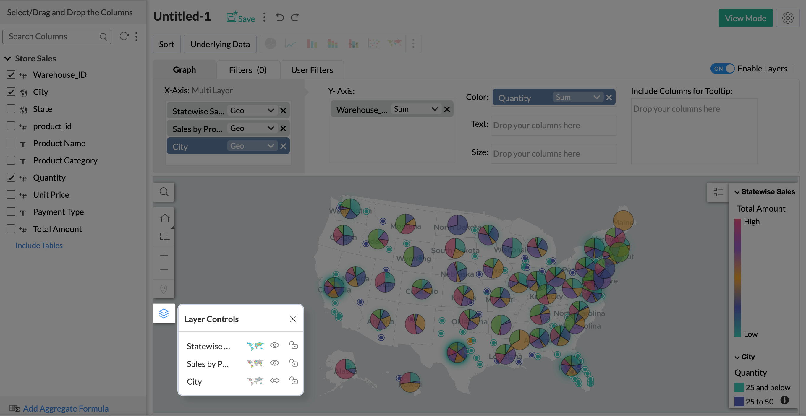
Enable Layers
To visualize multiple layers of data on a single map, you need to enable the Map Layering feature.
To enable map layers,
- Access the workspace and click +Create at the top left corner, then choose Chart View from the drop-down menu.
- The Chart Designer page will open.
- Check the Enable Layers toggle button at the top right corner of the shelves section to enable map layering.
Note:
- The Map Layering feature is specifically designed for Geo Map Charts, allowing you to overlay multiple datasets on the same geographical map simultaneously.
- Attempting to layer different chart types other than a geo map is not supported.
- You can add up to five layers to the same geo map for comprehensive data visualization.
Creating a Map Layer
Creating map layers follows a similar process to creating a Geo map. The main distinction is that you are creating multiple geo maps as individual layers within the same designer page.
Refer to the presentation below for detailed steps:
Customizing Map Layers
1. Can I change the chart type of each layer individually?
Yes, you can change the chart type of each layer individually. Changing the chart type allows for better analysis and deeper insights into each layer.
To change the chart type,
- Create a map chart with multiple map layers.
- Click on the Layer Controls icon on the left side panel of the map.
- The Layer Controls menu will appear.
- Select the Chart Chooser icon, and the list of all the suitable map layers will appear.
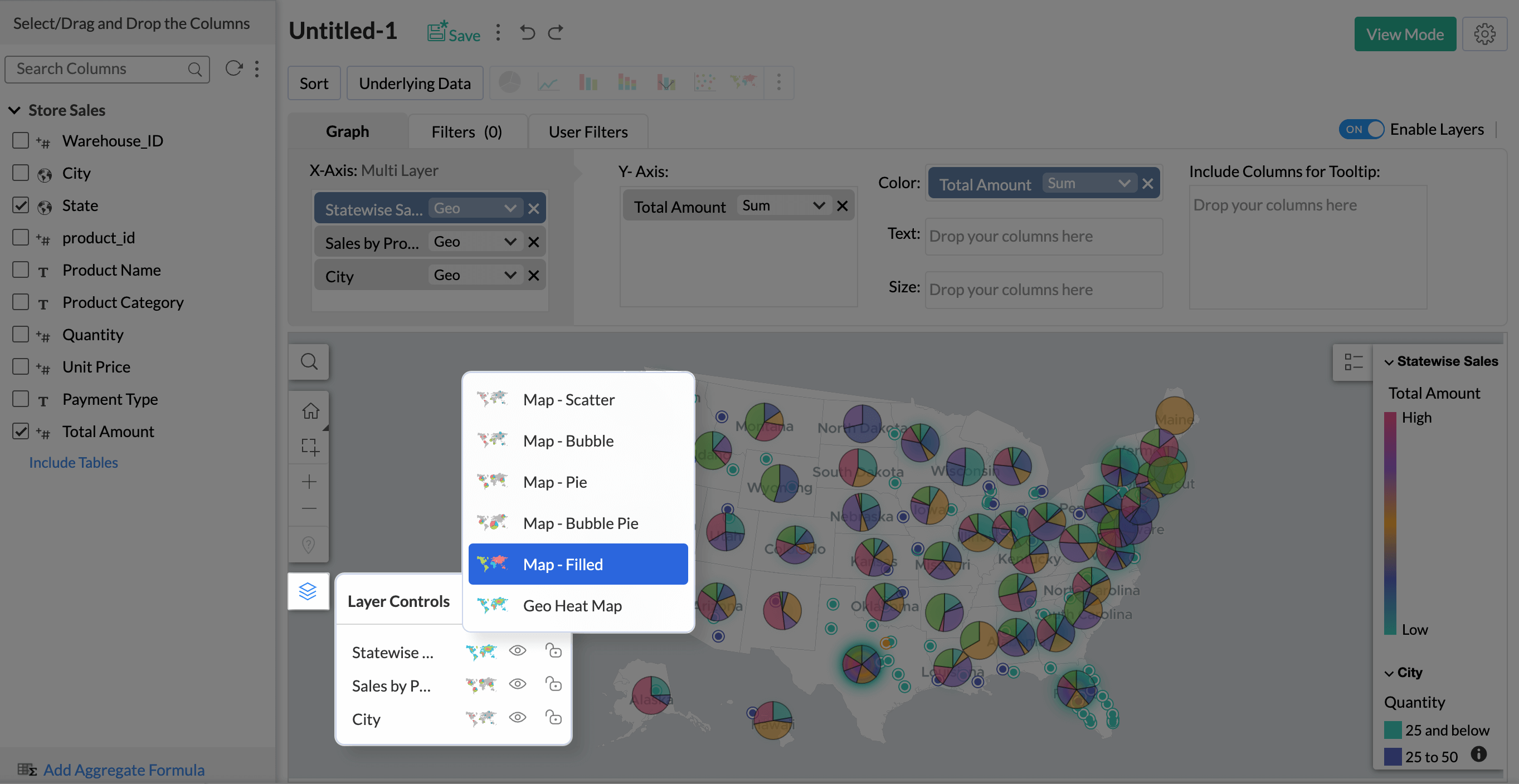
- Select the appropriate chart of your choice for better analysis.


2.How do I hide a layer in map layering?
To hide a layer in map layering, follow these steps,
- Open your map with multiple layers.
- Click on the Layer Controls icon.
- In the Layer Controls menu, find the layer you want to hide.
- Click the Hide Layer icon next to the layer to hide it.
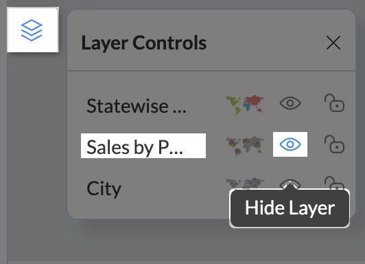
- The hidden layer will no longer be displayed on the geo map.

3.How can I lock a layer in map layering?
Lock layer feature allows you to manage and customize the interaction of layers within your map layering setup effectively.
To lock a layer in map layering, use the following steps,
- Open your map with multiple layers.
- Find the Layer Controls icon on the left side panel of the map.
- Click on the Layer Controls icon.
- In the Layer Controls menu, find the layer you wish to lock.
- Click on the Lock Layer icon next to the layer to lock it.
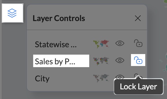
- A locked layer remains visible on the map but prevents interaction with its data values.

4. How do I check and resolve unresolved locations in map layers?
You can identify and fix unresolved locations directly within the map layering feature.
- Open the map layer report and click Edit Mode at the top.
- If you have any unresolved locations, an Unresolved Location(s) icon will appear in the Map toolbar.

- Click this icon to open the Edit Unresolved Locations dialog.
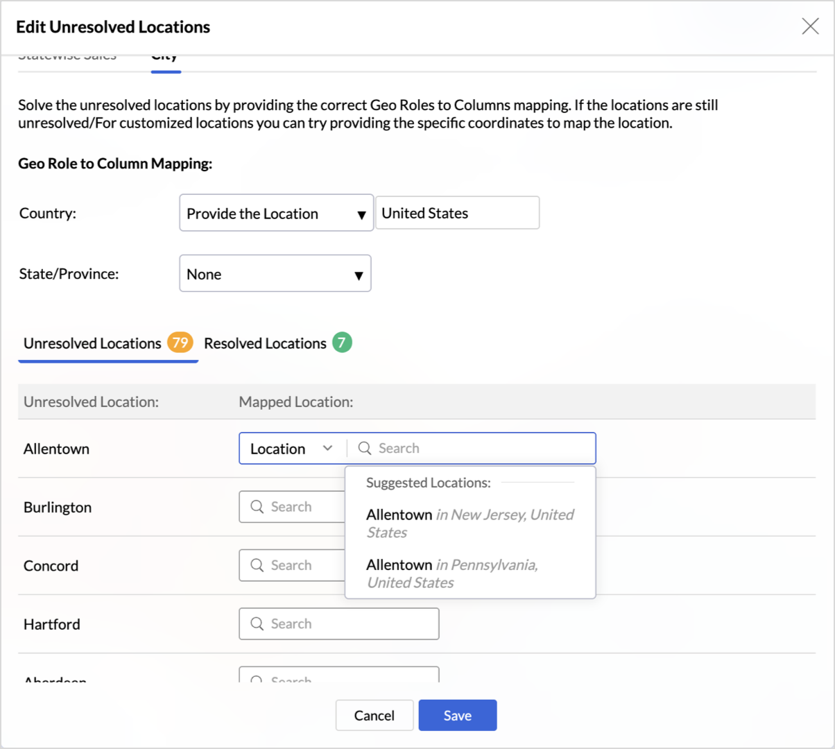
- This dialog will list all locations that the system could not automatically plot on the map. From here, you can review the details and resolve them by manually correcting the location data or assigning coordinates.
- For more details, refer to the section on fixing unresolved locations.


5. How to configure drill through action in map layers?
The drill-through action allows users to navigate from a data point on your map to a related report, passing the selected context as a filter. This helps in analyzing metrics or dimensions in greater detail.
For example, if you have a layer showing Total Sales by State and another showing Product Category Sales by State, you can configure a drill-through to a City-wise Sales report. This helps you see which cities perform best and which product categories lead in that region.
Note: You can configure different drill-through actions for each layer independently.
To configure a Drill Through Action,
- Click the Settings icon in the top-right corner of the chart and select Map tab.
- Navigate to the specific layer where you want to enable the action and select the Drill tab.
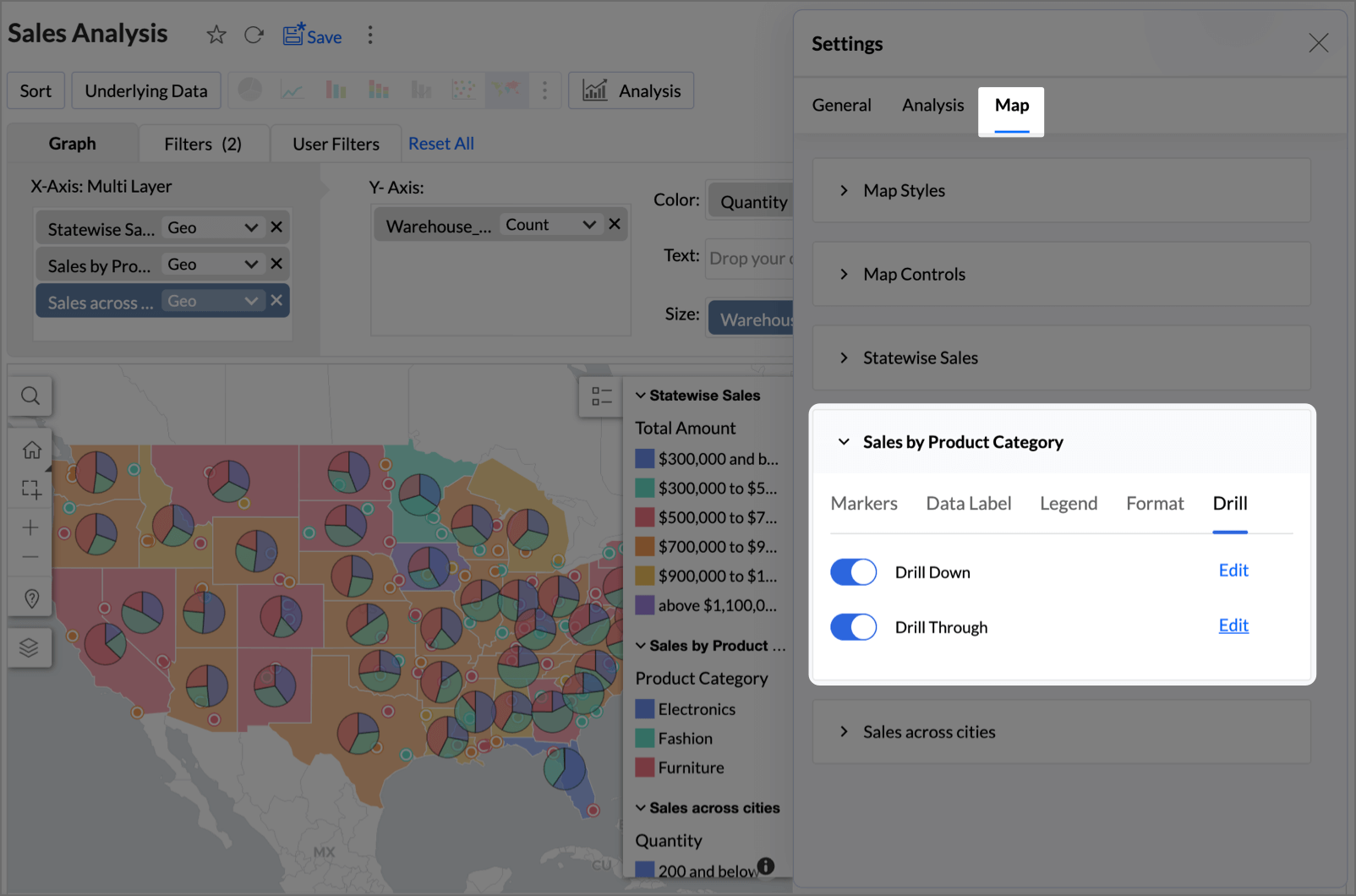
- Enable the Drill Through toggle.
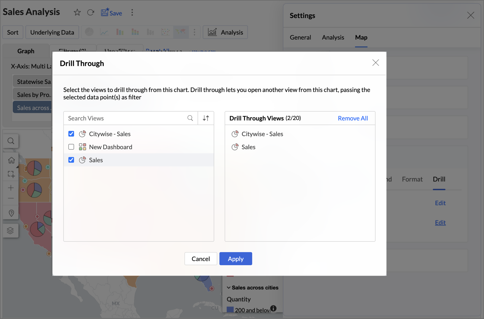
- Select the target reports or views you wish to drill through to. The list will show all available views created from the same table or related tables.
- Click Apply to save the configuration.


6. Can a Map Layer report be used as a filter in a dashboard?
Yes, absolutely. You can use any data point from a map layer as an interactive filter for other widgets and reports within your dashboard.
When a user selects a state, city, or region on the map, it can filter other widgets and reports on the same dashboard, creating a dynamic and linked analytical experience.
To learn more about using reports as filters in dashboards, click here.
Network Charts
Network charts on a Geo Map provide a visual representation of the relationships between different geographical locations. By using nodes (points) and connecting lines, these charts illustrate how various locations are linked through movement, flow, or influence, effectively mapping out the network of interactions across an area.
In Zoho Analytics, you can create these network charts effortlessly using the map-layering feature. This process involves two main steps:
Step 1: Creating Points and Lines
First, you need to convert the source and destination information into geographical encoding (Points) and then establish the connection (Line) between them.
- Open the table that has the Latitude and Longitude of the Source/ Destination.
- Points - Convert source and destination information into geographical coordinates using the makepoint() function.
For example,makepoint(latitude1, longitude1) - Lines - Use the makeline() function to draw connections between these points.
For example,makeline(source, destination)makeline(makepoint(latitude1, longitude1), makepoint(latitude2, longitude2))
Step 2: Adding Layers
The points and lines are the prerequisite to create the Network Chart. After generating the points and lines, add them as distinct layers in your Geo Map.
- Open the Chart Designer page.
- Add the source and the destination point as distinct layers.
- Establish the connection between them by adding lines as the third layer (Chart type - Map Filled should be used as the third layer) into your Geo Map.

This approach not only highlights critical connections—such as trade routes, migration patterns, or transportation networks—but also makes it easier to analyze and interpret complex relationships across different regions.